Using ZK Borderlayout
![]() This article is out of date, please refer to http://books.zkoss.org/zkessentials-book/master/ for more up to date information.
This article is out of date, please refer to http://books.zkoss.org/zkessentials-book/master/ for more up to date information.
Using ZK Border Layout
Suppose in our shopping cart application, we have the following requirements:
- Product View - A table displaying the available products to purchase
- Shopping Cart View - A list of items placed in the shopping cart
- Order View - A record of all the orders placed
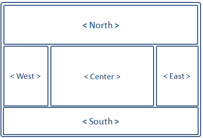
The borderlayout divides a page into five sections: North, East, Center, West, South.

Border Layout Attributes
The attributes involved in the configuration of border layout is listed in the table below:
| Attributes | Sample | Description |
|---|---|---|
| size | <north size="20%">...</north> <south size="180px">...</south> | set size in pixels or a percentage relative to its parent component |
| border | <east border="normal">...</east> | show/hide border; "normal" shows border, while "none" hides border |
| collapsible | <west collapsible="true">...</west> | allow the whole division to show/hide |
| maxsize/minsize | <south splitter="true" maxsize="500px" minisize="200px">...</south> | set the maximum and minimum allowable size for a component; |
| splittable | <north splittable="true">...</north> | allow the contents area size to be adjustable |
Borderlayout Configuration Notes
Some rules to oblige to when working with the border layout:
- The center component does not take size attributes; its height is dependent on the north and south components, while its width is dependent on the east and west components
- Each children component of borderlayout, ie. north, east, center, west, and south, are allowed only one child component; therefore, wrap multiple components in container components such as Div or Window when placing them in borderlayout's children components.
- The borderlayout component itself (not its children: north, west, etc..) do not have the "border" attribute
Why Use Borderlayout
Border Layout stands out as the obvious choice because it supports:
- splittable, so we could adjust the dimensions of the views by dragging the splitters.
- collapsible, so views could be collapsed to make room for other views.
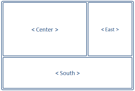
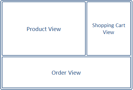
Using the Borderlayout, we could outline the shopping cart application like the following:

The borders can be made adjustable (splittable="true"), and the east and south components can be collapsed to give room to the center component displaying the Product View.
Implementing the Views
