Tab Boxes
![]() This documentation is for an older version of ZK. For the latest one, please click here.
This documentation is for an older version of ZK. For the latest one, please click here.
Components: tabbox, tabs, tab, tabpanels and tabpanel.
A tab box allows developers to separate a large number of components into several groups, and show one group at a time simplifying the user interface. There is only one grouping component (aka. a panel) that is visible at the same time. Once the tab of an invisible group is clicked, it becomes visible and the previous displayed group becomes invisible.
The generic syntax of tab boxes is as follows.
<zk>
	<tabbox>
	    <tabs>
	        <tab label="First"/>
	        <tab label="Second"/>
	    </tabs>
	    <tabpanels>
	        <tabpanel>The first panel.</tabpanel>
	        <tabpanel>The second panel</tabpanel>
	    </tabpanels>
	</tabbox>
</zk>
tabbox: The outer box that contains the tabs and tab panels.
tabs: The container for the tabs, i.e., a collection oftabcomponents.
tab: A specific tab, clicking on the tab brings the tab panel to the front. You can place a label and an image on it.
tabpanels: The container for the tab panels, i.e., a collection oftabpanelcomponents.
tabpanel: The body of a single tab panel. You would place the content for a group of components within a tab panel. The firsttabpanelcorresponds to the firsttab, the secondtabpanelcorresponds to the secondtaband so on.
The currently selected tab component is given an additional selected property which is set to true. This is used to give the currently selected tab a different appearance making it appear selected. Only one tab will have a true value for this property at a time.
There are two ways to change the selected tab using Java. They are shown below.
tab1.setSelected(true);
tabbox.setSelectedTab(tab1);
Of course, you can assign true to the selected property directly.
<tab label="My Tab" selected="true"/>
If none of tabs are selected, the first one is selected automatically.
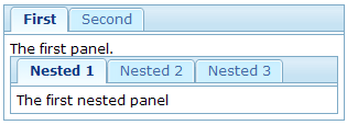
Nested Tab Boxes
A tab panel could contain anything including other tab boxes.
<zk>
	<tabbox>
		<tabs>
			<tab label="First" />
			<tab label="Second" />
		</tabs>
		<tabpanels>
			<tabpanel>
				The first panel.
				<tabbox>
					<tabs>
						<tab label="Nested 1" />
						<tab label="Nested 2" />
						<tab label="Nested 3" />
					</tabs>
					<tabpanels>
						<tabpanel>The first nested panel</tabpanel>
						<tabpanel>The second nested panel</tabpanel>
						<tabpanel>The third nested panel</tabpanel>
					</tabpanels>
				</tabbox>
			</tabpanel>
			<tabpanel>The second panel</tabpanel>
		</tabpanels>
	</tabbox>
</zk>
The Accordion Tab Boxes
Tab boxes support two molds: default and accordion. The effect of the accordion mold is as follows.
<zk>
	<tabbox mold="accordion">
		<tabs>
			<tab label="First" />
			<tab label="Second" />
		</tabs>
		<tabpanels>
			<tabpanel>The first panel.</tabpanel>
			<tabpanel>The second panel</tabpanel>
		</tabpanels>
	</tabbox>
</zk>
The orient Property
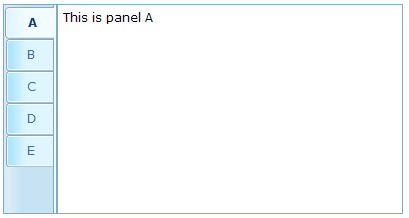
Developers can control where the tabs are located by use of the orient attribute. By default, it is horizontal, however, you can change it to vertical, and the effect is as follows.
<zk>
	<tabbox width="400px" orient="vertical">
		<tabs>
			<tab label="A" />
			<tab label="B" />
			<tab label="C" />
			<tab label="D" />
			<tab label="E" />
		</tabs>
		<tabpanels>
			<tabpanel>This is panel A</tabpanel>
			<tabpanel>This is panel B</tabpanel>
			<tabpanel>This is panel C</tabpanel>
			<tabpanel>This is panel D</tabpanel>
			<tabpanel>This is panel E</tabpanel>
		</tabpanels>
	</tabbox>
</zk>
The align Property of Tabs
Developers can control the alignment of a tab by use of the tabs』 align attribute. By default, it is set to start (leftmost or uppermost) but you are able to change it to center or end (rightmost or bottommost), and the effect is as follows.
<tabbox width="250px">
	<tabs align="end">
		<tab label="Tab 1" />
		<tab label="Tab 2" />
	</tabs>
	<tabpanels>
		<tabpanel>This is panel 1</tabpanel>
		<tabpanel>This is panel 2</tabpanel>
	</tabpanels>
</tabbox>
The closable Property
By setting the closable property to true, a close button is shown on the tab enabling the user to close the tab and the corresponding tab panel. Once the user clicks on the close button, an onClose event is sent to the tab. It is processed by the onClose method of Tab and then the onClose event, by default, detaches the tab itself and the corresponding tab panel.
Please also see the window's closable property.
The disabled Property
By setting the disabled property of tab to be true, the user could not select or close the corresponding tab by clicking the tab or close button. However, developers can still control the selection or close the tab via code.
<zk>
	<tabbox width="300px" id="tbx">
		<tabs>
			<tab label="Step 1" id="tb1" disabled="true" />
			<tab label="Step 2" id="tb2" disabled="true" />
			<tab label="Step 3" id="tb3" disabled="true" />
		</tabs>
		<tabpanels>
			<tabpanel>
				<button label="to Step2" onClick="tbx.selectedTab=tb2" />
			</tabpanel>
			<tabpanel>
				<button label="to Step3" onClick="tbx.selectedTab=tb3" />
			</tabpanel>
			<tabpanel>This is panel 3</tabpanel>
		</tabpanels>
	</tabbox>
</zk>
Load-on-Demand for Tab Panels
Like many other components, you can load the content of the tab panel only when it becomes visible. The simplest way is to use the fulfill attribute to defer the creation of the children of a tab panel.
<zk>
	<tabbox>
		<tabs>
			<tab label="Preload" selected="true" />
			<tab id="tab2" label="OnDemand" />
		</tabs>
		<tabpanels>
			<tabpanel> T
				his panel is pre-loaded since no fulfill specified
			</tabpanel>
			<tabpanel fulfill="tab2.onSelect">
				This panel is loaded only tab2 receives
				the onSelect event
			</tabpanel>
		</tabpanels>
	</tabbox>
</zk>
If you prefer to create the children manually or manipulate the panel dynamically, you can listen to the onSelect event, and then fulfill the content of the panel when it is selected, as depicted below.
<zk>
	<tabbox id="tabbox" width="400" mold="accordion">
		<tabs>
			<tab label="Preload" />
			<tab label="OnDemand" onSelect="load(self.linkedPanel)" />
		</tabs>
		<tabpanels>
			<tabpanel>
				This panel is pre-loaded.
			</tabpanel>
			<tabpanel>
			</tabpanel>
		</tabpanels>
		<zscript><![CDATA[
			void load(Tabpanel panel) {
			    if (panel != null && panel.getChildren().isEmpty())
			        new Label("Second panel is loaded").setParent(panel);
			}
	    ]]>
	    </zscript>
	</tabbox>
</zk>


