Responsive Design"
Jumperchen (talk | contribs) (Created page with "{{ZKDevelopersReferencePageHeader}} __TOC__ The [http://en.wikipedia.org/wiki/Responsive_Web_Design Responsive Design] in ZK separates the following three sections, for more fe...") |
(Redirected page to ZK Developer's Reference/Responsive Design) Tag: New redirect |
||
| (8 intermediate revisions by 3 users not shown) | |||
| Line 1: | Line 1: | ||
| + | #REDIRECT [[ZK_Developer's_Reference/Responsive_Design]] | ||
| + | |||
{{ZKDevelopersReferencePageHeader}} | {{ZKDevelopersReferencePageHeader}} | ||
__TOC__ | __TOC__ | ||
| − | The [http://en.wikipedia.org/wiki/Responsive_Web_Design Responsive Design] in ZK separates the following three sections, for more features in tablet | + | The [http://en.wikipedia.org/wiki/Responsive_Web_Design Responsive Design] in ZK separates the following three sections, for more features in tablet devices, please refer to [[ZK_Component_Reference/Tablet_Devices | Component Reference]]. |
= Fluid Layouts = | = Fluid Layouts = | ||
| − | + | {{versionSince|5.0}} | |
You can adjust the component size using either [[ZK Developer's Reference/UI_Patterns/Hflex_and_Vflex | ''vflex'' or ''hflex'']] instead of giving components a fixed height and/or width in pixels. | You can adjust the component size using either [[ZK Developer's Reference/UI_Patterns/Hflex_and_Vflex | ''vflex'' or ''hflex'']] instead of giving components a fixed height and/or width in pixels. | ||
| Line 13: | Line 15: | ||
[[File:Fluid_Layouts.PNG]] | [[File:Fluid_Layouts.PNG]] | ||
| − | <source lang="xml" | + | <source lang="xml" highlight="2,7,12"> |
<hlayout vflex="1"> | <hlayout vflex="1"> | ||
<window title="Column 25%" vflex="1" hflex="1" sclass="column1" border="normal"> | <window title="Column 25%" vflex="1" hflex="1" sclass="column1" border="normal"> | ||
| Line 33: | Line 35: | ||
</source> | </source> | ||
| − | + | The above example code can be downloaded here - [https://github.com/jumperchen/ZKResponsiveDesign/blob/master/src/main/webapp/layout/layout1.zul Github]. | |
= Adaptive Layouts = | = Adaptive Layouts = | ||
| Line 43: | Line 45: | ||
[[File:Adaptive_Layouts.PNG]] | [[File:Adaptive_Layouts.PNG]] | ||
| − | <source lang="xml" | + | <source lang="xml" highlight="14,24"> |
<?taglib uri="http://www.zkoss.org/dsp/web/theme" prefix="t"?> | <?taglib uri="http://www.zkoss.org/dsp/web/theme" prefix="t"?> | ||
<zk> | <zk> | ||
<style> | <style> | ||
.z-hlayout-inner { | .z-hlayout-inner { | ||
| − | ${ | + | ${| class='wikitable' | width="100%" |
height: 100%; | height: 100%; | ||
} | } | ||
| Line 95: | Line 97: | ||
</source> | </source> | ||
| − | As you can see, we remove the ''vflex'' and ''hflex'' for the ''Window'' component and replace | + | As you can see, we remove the ''vflex'' and ''hflex'' for the ''Window'' component and replace them with a pure CSS style and some condition statements with the ''@media'' query to switch the layout to fit the screen size. '''max-width: 1024px''' for ipad or tablet devices and '''max-width: 750px''' for iphone or smartphones. But those changes are only client effects, what can a ZK developer do in server side if the orientation changes? How many component's stylings need to be scaled when displaying in touch devices? These answers can be found in the following section. |
| − | + | The above example code can be downloaded here - [https://github.com/jumperchen/ZKResponsiveDesign/blob/master/src/main/webapp/layout/layout2.zul Github]. | |
= Responsive Design (mix all) = | = Responsive Design (mix all) = | ||
| − | + | {{versionSince|6.5}} | |
| − | In ZK 6.5, we refined and polished all components so that they perform seamlessly whether they are on a PC's browser or a Tablet device. In some of the use cases the default styling is not satisfied for user to adjust the layout for different devices and screen sizes, therefore we can employ [[ZK_Component_Reference/Tablet_Devices/Events/ClientInfoEvent | the ClientInfoEvent]] to detect whether the browser's orientation | + | In ZK 6.5, we refined and polished all components so that they perform seamlessly whether they are on a PC's browser or a Tablet device. In some of the use cases the default styling is not satisfied for user to adjust the layout for different devices and screen sizes, therefore we can employ [[ZK_Component_Reference/Tablet_Devices/Events/ClientInfoEvent | the ClientInfoEvent]] to detect whether the browser's orientation changes, and then switch some components' orientation to conform that. |
For example, | For example, | ||
| Line 109: | Line 111: | ||
== Zul Source Code == | == Zul Source Code == | ||
| − | <source lang="xml" | + | <source lang="xml" highlight="3,17,18,44,79"> |
<zk> | <zk> | ||
<zscript><![CDATA[ | <zscript><![CDATA[ | ||
| Line 217: | Line 219: | ||
== CSS Content == | == CSS Content == | ||
| − | <source lang="css" | + | <source lang="css" highlight="4,10,43,88"> |
<%@ taglib uri="http://www.zkoss.org/dsp/web/core" prefix="c" %> | <%@ taglib uri="http://www.zkoss.org/dsp/web/core" prefix="c" %> | ||
<%@ taglib uri="http://www.zkoss.org/dsp/web/theme" prefix="t" %> | <%@ taglib uri="http://www.zkoss.org/dsp/web/theme" prefix="t" %> | ||
| Line 297: | Line 299: | ||
margin-left: 10px; | margin-left: 10px; | ||
border: 3px solid #CFCFCF; | border: 3px solid #CFCFCF; | ||
| − | ${ | + | ${| class='wikitable' | width="100%" |
${t:boxShadow('0 0 7px rgba(0, 0, 0, 0.70)')}; | ${t:boxShadow('0 0 7px rgba(0, 0, 0, 0.70)')}; | ||
} | } | ||
| Line 338: | Line 340: | ||
| − | + | The above example code can be downloaded here - [https://github.com/jumperchen/ZKResponsiveDesign/blob/master/src/main/webapp/layout/layout3.zul Github]. | |
| + | |||
| + | = Related Articles = | ||
| + | We also recommend to read the articles below: | ||
| + | * [[Small_Talks/2017/August/Responsive_Design_in_ZK_Part_1 | Responsive_Design_in_ZK_Part_1]] | ||
| + | * [[Small_Talks/2017/October/Responsive_Design_in_ZK_Part_2 | Responsive_Design_in_ZK_Part_2]] | ||
| + | * [[Small_Talks/2017/October/Responsive_Design_in_ZK_Part_3 | Responsive_Design_in_ZK_Part_3]] | ||
| + | * [[Small_Talks/2019/August/Use_Bootstrap_with_ZK:_Responsive_Admin_Template | Use_Bootstrap_with_ZK:_Responsive_Admin_Template]] | ||
=Version History= | =Version History= | ||
| − | + | ||
| − | {| | + | {| class='wikitable' | width="100%" |
! Version !! Date !! Content | ! Version !! Date !! Content | ||
|- | |- | ||
Latest revision as of 10:10, 23 April 2024
Redirect to:
The Responsive Design in ZK separates the following three sections, for more features in tablet devices, please refer to Component Reference.
Fluid Layouts
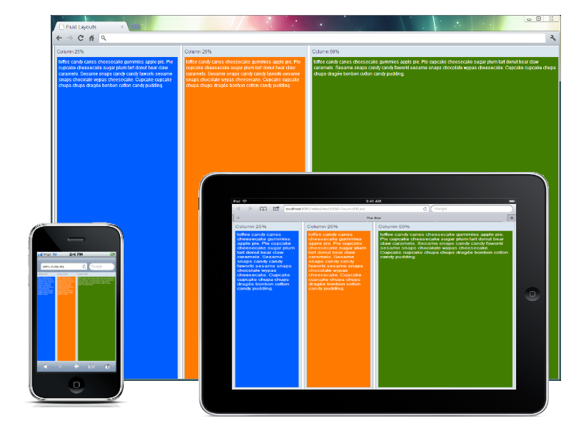
Since 5.0 You can adjust the component size using either vflex or hflex instead of giving components a fixed height and/or width in pixels.
For example,
<hlayout vflex="1">
	<window title="Column 25%" vflex="1" hflex="1" sclass="column1" border="normal">
			toffee candy canes cheesecake gummies apple pie. Pie cupcake cheesecake sugar plum tart donut
			bear claw caramels. Sesame snaps candy candy faworki sesame snaps chocolate wypas cheesecake.
			Cupcake cupcake chupa chups dragée bonbon cotton candy pudding.
	</window>
	<window title="Column 25%" vflex="1" hflex="1" sclass="column2" border="normal">
			toffee candy canes cheesecake gummies apple pie. Pie cupcake cheesecake sugar plum tart donut
			bear claw caramels. Sesame snaps candy candy faworki sesame snaps chocolate wypas cheesecake.
			Cupcake cupcake chupa chups dragée bonbon cotton candy pudding.
	</window>
	<window title="Column 50%" vflex="1" hflex="2" sclass="column3" border="normal">
			toffee candy canes cheesecake gummies apple pie. Pie cupcake cheesecake sugar plum tart donut
			bear claw caramels. Sesame snaps candy candy faworki sesame snaps chocolate wypas cheesecake.
			Cupcake cupcake chupa chups dragée bonbon cotton candy pudding.
	</window>
</hlayout>
The above example code can be downloaded here - Github.
Adaptive Layouts
[CSS 3 only]
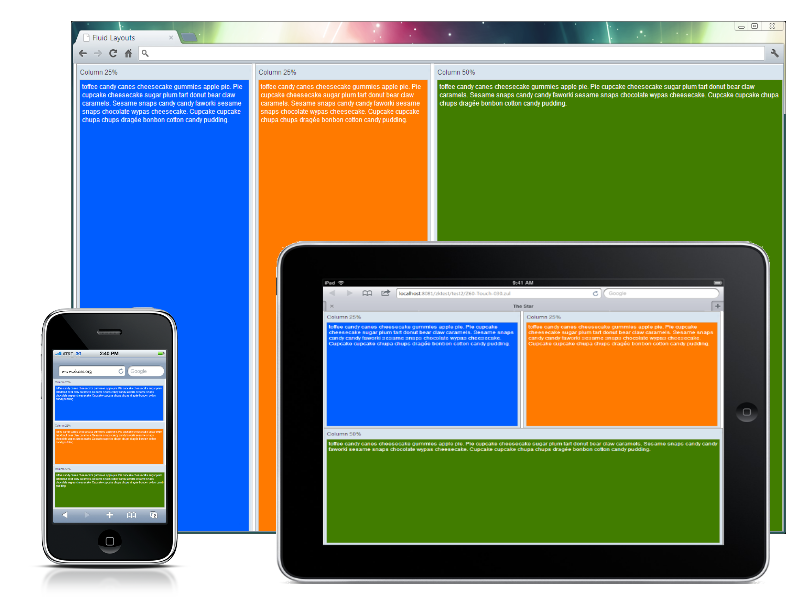
The adaptive layout is more advantageous than Fluid Layouts, the problem we met in the fluid layout is that its content can only change to the screen's size, but the layout may break if the screen is not big enough. The adaptive layout can solve this by using CSS 3 Media Query.
For example,
<?taglib uri="http://www.zkoss.org/dsp/web/theme" prefix="t"?>
<zk>
<style>
.z-hlayout-inner {
	${| class='wikitable' | width="100%"
	height: 100%;
}
.z-hlayout-inner {
	width: 25%;
}
.z-hlayout-inner:last-child {
	width: 50%;
}
@media screen and (max-width: 1024px) {
	.z-hlayout-inner {
		width: 50%;
		height: 50%;
	}
	.z-hlayout-inner:last-child {
		width: 100%;
		display: block;
	}
}
@media screen and (max-width: 750px) {
	.z-hlayout-inner {
		width: 100%;
		height: 33%;
		display: block;
	}
}
</style>
<hlayout vflex="1">
	<window title="Column 25%" height="100%" sclass="column1" border="normal">
		toffee candy canes cheesecake gummies apple pie. Pie cupcake cheesecake sugar plum tart donut
		bear claw caramels. Sesame snaps candy candy faworki sesame snaps chocolate wypas cheesecake.
		Cupcake cupcake chupa chups dragée bonbon cotton candy pudding.
	</window>
	<window title="Column 25%" height="100%" sclass="column2" border="normal">
		toffee candy canes cheesecake gummies apple pie. Pie cupcake cheesecake sugar plum tart donut
		bear claw caramels. Sesame snaps candy candy faworki sesame snaps chocolate wypas cheesecake.
		Cupcake cupcake chupa chups dragée bonbon cotton candy pudding.
	</window>
	<window title="Column 50%" height="100%" sclass="column3" border="normal">
		toffee candy canes cheesecake gummies apple pie. Pie cupcake cheesecake sugar plum tart donut
		bear claw caramels. Sesame snaps candy candy faworki sesame snaps chocolate wypas cheesecake.
		Cupcake cupcake chupa chups dragée bonbon cotton candy pudding.
	</window>
</hlayout>
</zk>
As you can see, we remove the vflex and hflex for the Window component and replace them with a pure CSS style and some condition statements with the @media query to switch the layout to fit the screen size. max-width: 1024px for ipad or tablet devices and max-width: 750px for iphone or smartphones. But those changes are only client effects, what can a ZK developer do in server side if the orientation changes? How many component's stylings need to be scaled when displaying in touch devices? These answers can be found in the following section.
The above example code can be downloaded here - Github.
Responsive Design (mix all)
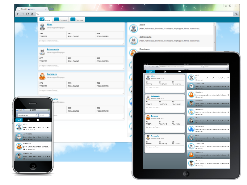
Since 6.5 In ZK 6.5, we refined and polished all components so that they perform seamlessly whether they are on a PC's browser or a Tablet device. In some of the use cases the default styling is not satisfied for user to adjust the layout for different devices and screen sizes, therefore we can employ the ClientInfoEvent to detect whether the browser's orientation changes, and then switch some components' orientation to conform that.
For example,
Zul Source Code
<zk>
<zscript><![CDATA[
void doOrientationChange(ClientInfoEvent evt) {
	if ("portrait".equals(evt.getOrientation())) {
		main.setWidth("100%");
		if (evt.getDesktopWidth() < 640)
			sv.setVisible(false);
		Clients.resize(content);
	} else {
		if (!execution.isBrowser("mobile"))
			main.setWidth("80%");
		sv.setVisible(true);
		Clients.resize(content);
	}
}
]]></zscript>
	<tabbox id="main" sclass="main" width="${zk.mobile > 0 ? '100%' : '80%'}"
		vflex="1" onClientInfo="doOrientationChange(event)" tabscroll="false"
		apply="org.zkoss.bind.BindComposer" viewModel="@id('vm') @init('TweetsVM')">
		<custom-attributes org.zkoss.zul.image.preload="true" />
		<tabs>
			<tab>
				<caption>
					<div sclass="home" />
					Home
				</caption>
			</tab>
			<tab>
				<caption>
					<image sclass="connect" />
					Connect
				</caption>
			</tab>
			<tab>
				<caption>
					<image sclass="discover" />
					Discover
				</caption>
			</tab>
		</tabs>
		<tabpanels vflex="1" hflex="1">
			<tabpanel vflex="1" hflex="1">
				<hlayout id="content" sclass="main-content" vflex="1">
					<scrollview id="sv" orient="vertical" vflex="1" hflex="1"
						visible="${zk.mobile > 0}" children="@init(vm.profiles)">
						<template name="children" var="profile">
							<groupbox mold="3d" sclass="profile" hflex="1">
								<vlayout>
									<hlayout>
										<image sclass="@bind(profile.ownerIcon)" />
										<vlayout>
											<a sclass="fullname" label="@bind(profile.author)" />
											<label value="View my profile page" style="color:gray" />
										</vlayout>
									</hlayout>
									<hlayout sclass="status">
										<div sclass="vbar first-vbar" hflex="1">
											<label sclass="number" value="@bind(profile.tweets)" />
											<separator />
											<label sclass="text" value="TWEETS" />
										</div>
										<div sclass="vbar" hflex="1">
											<label sclass="number" value="@bind(profile.following)" />
											<separator />
											<label sclass="text" value="FOLLOWING" />
										</div>
										<div sclass="vbar" hflex="1">
											<label sclass="number" value="@bind(profile.followers)" />
											<separator />
											<label sclass="text" value="FOLLOWERS" />
										</div>
									</hlayout>
									<textbox rows="2" placeholder="Compose new Tweet..."
										multiline="true" hflex="1" />
								</vlayout>
							</groupbox>
						</template>
					</scrollview>
					<listbox model="@load(vm.tweets)" vflex="1" hflex="1">
						<template name="model" var="tweet">
							<listitem>
								<listcell>
									<hlayout>
										<image sclass="@load(tweet.authorIcon)" />
										<div>
											<label sclass="author" value="@load(tweet.author)" />
											<separator />
											<label sclass="content" multiline="true"
												value="@load(tweet.content)" />
										</div>
									</hlayout>
								</listcell>
							</listitem>
						</template>
					</listbox>
				</hlayout>
			</tabpanel>
		</tabpanels>
	</tabbox>
</zk>
In this example, we layout the page with ZUL Components and only register the ClientInfoEvent to handle the display when re-orientating . We manage the main content of the listbox using vflex and hflex to expand the tweet's content according to the max height, and then we apply the same concepts mentioned in Adaptive Layouts, with @Media Query to fine tune some areas in the page, for example making profile area invisible on smartphones. For an example of this you can refer to the following CSS Content section for more details.
Note: Some of the components and features used above are available in ZK EE only.
CSS Content
<%@ taglib uri="http://www.zkoss.org/dsp/web/core" prefix="c" %>
<%@ taglib uri="http://www.zkoss.org/dsp/web/theme" prefix="t" %>
<%-- For tablet or orientation in portrait devices  --%>
@media only screen and (orientation:portrait) {
	body {
		margin: 0;
		padding: 0;
		${t:gradient('ver', '#cedce7 0%;#596a72 100%')};
	}
	<%-- Customize the default tabbox styling --%>
	.z-tabs-header {
		height: auto;
		background: black;
	}
	.z-tabs-cnt > li.z-tab,
	.z-tabs-cnt > .z-tab:active {
		background: transparent;
		${t:boxShadow('none')};
		border: 0;
		width: 128px;
		height: 32px;
	}
	.z-tab .z-label {
		display: none;
	}
	.z-tabs-cnt > li.z-tab.z-tab-seld,
	.z-tabs-cnt > li.z-tab.z-tab-seld:first-child,
	.z-tabs-cnt > li.z-tab.z-tab-seld:active,
	.z-tabs-cnt > li.z-tab.z-tab-seld:active:first-child {
		background: black;
		border-color: transparent;
		${t:boxShadow('1px 1px 0 black')};
	}
	.z-tabs-cnt > .z-tabs {
		background: #555;
	}
	td.z-caption-r {
		text-align: center;
	}
	.main-content {
		max-height: 2048px;
	}
	<%-- Change the tab styling --%>
	.z-tab .home {
		background: transparent;
	}
	.z-tab-seld .home {
		background: ${t:gradValue('ver', '#02ABDE 0%; #007497 50%; #02ABDE 100%')};
	}
	.home:before {
		top: 12px;
		left: 25px;
	}
	.home:after {
		top: -1px;
		left: 30px;
	}
	.connect {
		background: url(${c:encodeURL('/images/icons/icon_friendrequests_white.png')}) no-repeat center center;
	}
	.discover {
		background: url(${c:encodeURL('/images/icons/icon_messagestop_white.png')}) no-repeat center center;
	}

	.z-tab .z-image,
	.z-tab .home {
		height: 32px;
		line-height: 28px;
		width: 80px;
	}
	tr.z-listbox-odd {
		${t:gradient('ver', '#cedce7 0%;#596a72 100%')};
	}
	.z-scrollview-content-ver:first-child .profile {
		margin: 10px;
	}
	.profile {
		margin-left: 10px;
		border: 3px solid #CFCFCF;
		${| class='wikitable' | width="100%"
		${t:boxShadow('0 0 7px rgba(0, 0, 0, 0.70)')};
	}
	.z-groupbox-3d-cnt {
		border: 0px;
	}
}
 <%-- For smartphones or small screen  --%>
@media screen and (orientation:portrait) and (max-width: 720px) {
	.main-content {
		max-height: 1024px;
	}
	.z-tabs-cnt > li.z-tab,
	.z-tabs-cnt > .z-tab:active {
		background: transparent;
		${t:boxShadow('none')};
		border: 0;
		width: 80px;
		height: 32px;
	}
	.z-tab .z-image,
	.z-tab .home {
		height: 32px;
		line-height: 28px;
		width: 60px;
	}
	.home:before {
		top: 12px;
		left: 20px;
	}
	.home:after {
		top: -1px;
		left: 25px;
	}
	.main-content > .z-hlayout-inner:first-child {
		display: none;
	}
}
The above example code can be downloaded here - Github.
Related Articles
We also recommend to read the articles below:
- Responsive_Design_in_ZK_Part_1
- Responsive_Design_in_ZK_Part_2
- Responsive_Design_in_ZK_Part_3
- Use_Bootstrap_with_ZK:_Responsive_Admin_Template
Version History
| Version | Date | Content |
|---|---|---|
| 6.5.0 | September, 2012 | ZK 6.5.0 Release |


