Use Bootstrap with ZK: Responsive Admin Template
Hawk Chen, Engineer, Potix Corporation
August, 2019
ZK 8.6.2
Overview
Bootstrap is a good friend to ZK framework. It provides a Grid system to apply responsive design on the page level and lots of utility CSS classes for setting color, alignment, padding, margin, and size. These utility are easy to pick up and apply within a zul file. In this small talk we have created an admin template application leveraging Bootstrap features to demonstrate various usages including:
- build an administration UI with ZK components
- reusing view snippet as a template
- easily apply responsive design (RWD) with Bootstrap
- create a custom component with shadow components
- develop in MVVM pattern
Online Demo
Designers Involved
Responsive web design (RWD) doesn't just happen magically, and it's also not a pure technical problem. At component level, ZK EE components can help -- they will turn themselves into different look & feel that best match the device they are on. But at page level, you cannot just make everything smaller, you need to decide what you wish to display in a smaller/limited screen. And to further make the page look nice it involves many things such as: the layout, colors, font size, padding, and margin.
Ideally the process starts with a designer that designs the pages for different responsive sizes. Then you, as a developer, implement these pages according to the design with tools like ZK and bootstrap. Here, with the right tools you can implement these pages much easier. In the case that there is no designer working with you, you can just reference a commonly-seen layout to get started.
In our case, we are lucky enough to have a designer who created the layout and styles for us.
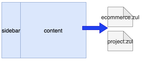
We start from navigation. As you can see, it is a typical layout for an administration system: sidebar + content
The sidebar shows the navigation items, and it determines the content. When a user click an item in the sidebar, it loads the corresponding content zul (e.g. ecommerce.zul or project.zul)
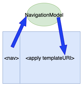
By <apply>, we can simplify the home page to few lines:
index.zul
    <hlayout viewModel="@id('vm')@init('org.zkoss.admin.MainVM')" width="100%">
        <apply templateURI="sidebar.zul" />
        <div sclass="container-fluid" hflex="1">
            <apply templateURI="@load(vm.navigationModel.contentUrl)"/>
        </div>
    </hlayout>
For switching among pages, I create NavigationModel and store it as a desktop attribute. Then, keep track the current zul at NavigationModel.contentUrl and bind this property to templateURI of <apply>. When a user clicks an item on the sidebar, we just set zul file path at NavigationModel.contentUrl, so that <apply> will load the corresponding zul.
Responsive Design Layout (RWD) with Bootstrap
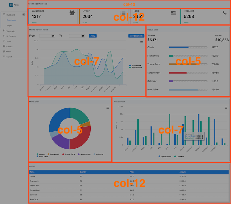
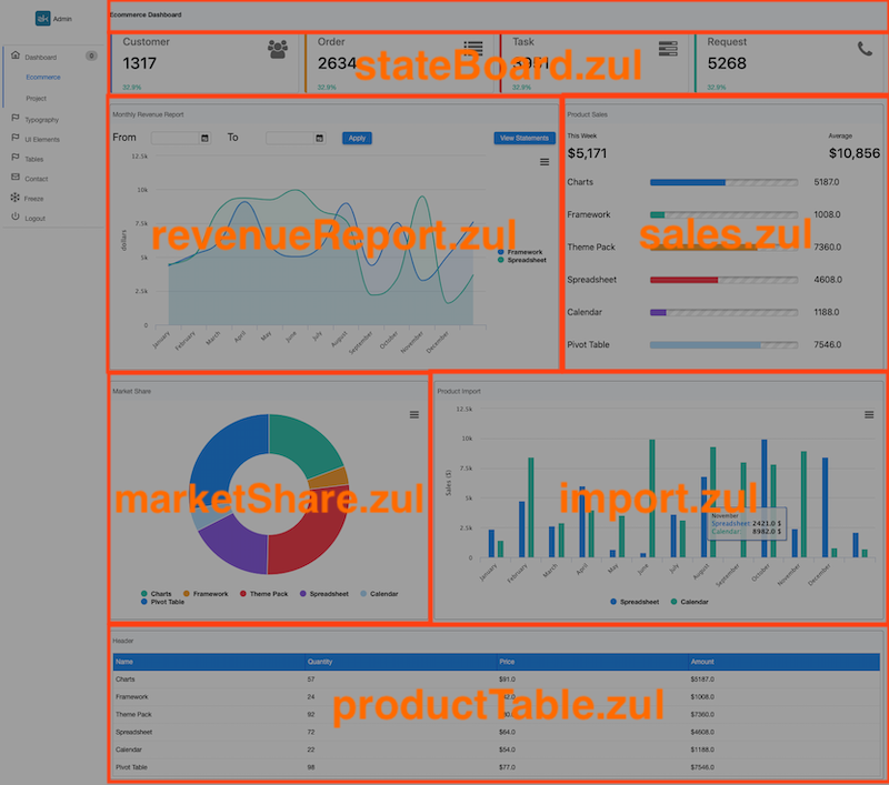
Bootstrap's grid system provides a great approach to achieve responsive design by dividing a page into rows. Each row is divided into 12 columns. We can specify the number of columns for each block in each row, for example:
- divide the content block into 5 rows
- divide the 3rd rows into 2 blocks: 7 columns and 5 columns
The result looks like:
Therefore, the page skeleton in a zul is:
<zk xmlns:n="native" >
    <div sclass="row">
        <n:div sclass="col"></n:div>
    </div>
    <div sclass="row">
    </div>
    <div sclass="row">
        <n:div sclass="col-md-7"></n:div>
        <n:div sclass="col-md-5"></n:div>
    <div sclass="row">
        <n:div sclass="col-md-5"></n:div>
        <n:div sclass="col-md-7"></n:div>
    </div>
    <div sclass="row">
        <n:div class="col-md-12"></n:div>
    </div>
</zk>
- line 1: declare namespace so that we can use HTML
to reduce memory consumption. - line 8-9: specify
col-md-7andcol-md-5to define a column width.
Padding & Margin
To apply padding and margin, we strongly suggest using Bootstrap's space utility CSS class. The classes are named using the format {property}{sides}-{size}. Bootstrap provides 5 levels of size (p-1 to p-5), and each is proportional to $spacers.
Hence, we can easily specify p-1 to apply 5px padding for each column (or p-2 to apply 10px). No need to specify pixels in CSS. These space utility can greatly simplify the troublesome tasks of specifying pixels.
    <div sclass="row py-1">
        <n:div sclass="col-md-7 p-1">
            ...
        </n:div>
        <n:div sclass="col-md-5 p-1">
            ...
        </n:div>
    </div>
- line2: To add space among rows, we specify py-1 on each row, which gives it 10px for top and bottom padding. (y for y-axis)
Reusing ZUL Snippet
In ecommerce.zul, you can see duplicate code below in several places:
    <div sclass="row py-1">
    </div>
Declare a Custom Component
Since a div with row class is commonly used in every zul, to avoid typing duplicate code in zul, we create a custom component, bs-row, with the pre-defined sclass, so that we don't have to specify each div.
	<component>
		<component-name>bs-row</component-name>
		<extends>div</extends>
		<property>
			<property-name>sclass</property-name>
			<property-value>row py-1</property-value>
		</property>
	</component>
<zk xmlns:n="native">
    <bs-row>
        ...
    </bs-row>
    <bs-row>
        ...
    </bs-row>
    <bs-row>
        ...
    </bs-row>
    <bs-row>
        ...
    </bs-row>
    <bs-row>
        ...
    </bs-row>
</zk>
Divide a Page
For such a big page, we strongly recommend you to divide it into several smaller zul files to reduce the complexity and increase the modularity. Each zul file has its own controller and doesn't depends on others, so that it is easier to rearrange them in future, e.g. you might want to switch positions of marketShare.zul and sales.zul.
Shadow component <apply/> can easily help us do it:
...
    <bs-row>
        <apply templateURI="ecommerce/stateBoard.zul"/>
    </bs-row>
    <bs-row >
        <n:div sclass="col-md-7 p-1">
            <apply templateURI="ecommerce/revenueReport.zul"/>
        </n:div>
        <n:div sclass="col-md-5 p-1">
            <apply templateURI="ecommerce/sales.zul"/>
        </n:div>
    </bs-row>
...
line 3: ZK injects the components in stateBoard.zul at this line, just like pasting the content of stateBoard.zul manually.
Nested Rows
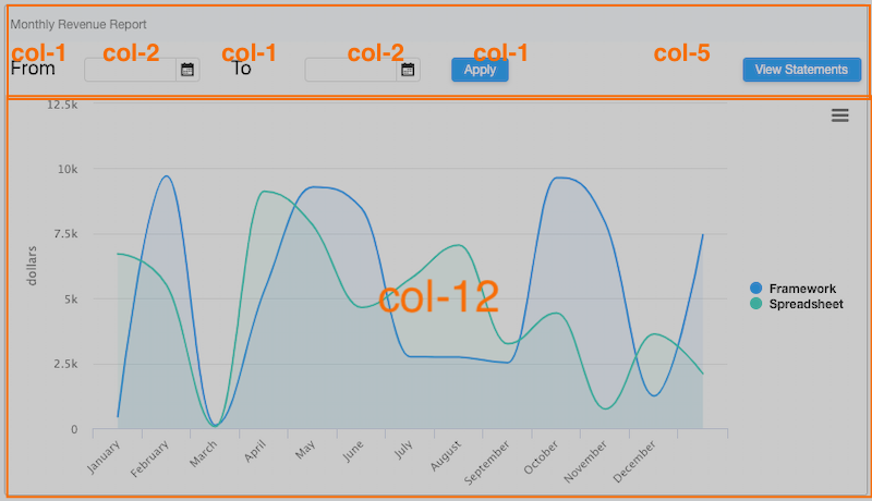
Even in a single column, bootstrap row can also help you layout components. In revenuReport.zul, we can divide it into 2 rows and separate each components into columns:
        <bs-row>
            <n:div class="col-lg-1">
                From
            </n:div>
            <n:div class="col-lg-2">
                <datebox hflex="1"/>
            </n:div>
            <n:div class="col-lg-1">
                To
            </n:div>
            <n:div class="col-lg-2">
                <datebox hflex="1"/>
            </n:div>
            <n:div class="col-lg-1">
                <button label="Apply"/>
            </n:div>
            <n:div class="col-lg-5 text-right">
                <button label="View Statements" />
            </n:div>
        </bs-row>
        <bs-row>
            <n:div class="col-12">
                <charts id="chart" type="areaspline" title="" hflex="1"/>
            </n:div>
        </bs-row>
- line 6: To make a component fill up a column and resize itself with a column width, we should use
hflex="1" - line 17: align text with Bootstrap utility class
Responsive Design (RWD) with ZK
Bootstrap's grid system can make rows responsive, but to change ZK component's style for responsiveness you can use @MatchMedia.
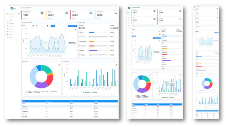
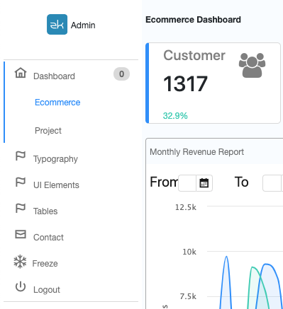
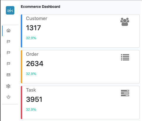
In admin template project, the sidebar is responsive to browser width:
wider sidebar
narrow sidebar
Switching Sidebar
We implement this responsive sidebar by toggle collapsed attribute.
First, we declare a boolean for collapsed attribute and detect browser width with @MatchMedia. When the browser width is wider than 958px, we set it to false, otherwise we set it to true.
public class SidebarVM {
    ...
    private boolean collapsed = false; //sidebar is collapsed for narrow screen

    ...

    // medium breakpoint 768 + 190 (sidebar width)
    @MatchMedia("all and (min-width: 958px)")
    @NotifyChange("collapsed")
    public void beWide(){
        collapsed = false;
    }

    @MatchMedia("all and (max-width: 957px)")
    @NotifyChange("collapsed")
    public void beNarrow(){
        collapsed = true;
    }
...
}
Then, bind collapsed with the boolean property vm.collapsed.
<navbar orient="vertical" collapsed="@load(vm.collapsed)">
We can also control the badge text's visibility by vm.collapsed:
        <nav label="@load(menuItem.label)" iconSclass="@load(menuItem.icon)"
             badgeText="@load(vm.collapsed ? '': menuItem.counter)">
            ...
        </nav>
Create Your Custom Component
With the help of shadow components and namespace, we can easily create custom components. Hence, you can design your own component in HTML and use it in a zul. In this section, I will introduce how to implement it using state box as an example:
Use HTML Elements with Namespace
ZK allows you to mix HTML tags in a zul by declaring a namespace. For example, there are 2 namespaces in the zul below:
<zk xmlns="native" xmlns:z="zul">
<div class="state-box rounded p-1 ${color}">
...
    <h6 class="text-black-50">${state.type}</h6>
    <h4>${state.value}</h4>
    <z:label sclass="text-success" .../>
...
</div>
- Line 1: Since HTML tags are in a majority, we declare it as the default namespace to avoid all prefix on HTML tags.
- Line 2: This div is an HTML div not a zk div. Therefore, you can see we specify
classinstead ofsclass. - Line 6: We declare namespace zul with the prefix z, so this is a ZK
Labelcomponent.
state-box
Implement Layout
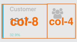
We still can divide a state-box with a row and 2 columns:
Then we compose this box mainly with HTML tags:
<zk xmlns="native" xmlns:z="zul">
    <div class="state-box rounded p-1">
        <div class="row">
            <div class="col-8 px-4">
                <h6 class="text-black-50"></h6>
                <h4></h4>
                <z:label sclass="text-success" />
            </div>
            <div class="col-4 text-right px-4">
                <h2>
                <i class=" text-black-50 h3"/>
                </h2>
            </div>
        </div>
    </div>
</zk>
Declare as a Custom Component
We put the code snippet above into an independent zul file and declare it as a custom component In metainfo/zk/lang-addon.xml:
	<component>
		<component-name>state-box</component-name>
		<template-uri>/WEB-INF/template/stateBox.zul</template-uri>
	</component>
	<stylesheet href="/resources/css/state-box.css" type="text/css"/>
- For complete syntax, please refer to ZK Client-side Reference/Language Definition
Use state-box
After declaring in a system-scope language definition, we can use the custom component state-box in any zul like:
    <nodom viewModel="@id('vm')@init('org.zkoss.admin.ecommerce.StateVM')">
        <forEach items="@init(vm.states)">
            <n:div sclass="col-12 col-md-6 col-lg-3 p-1">
                <state-box />
            </n:div>
        </forEach>
    </nodom>
- Line 1: nodom is a better component than div for just grouping components, since it doesn't generate any DOM element to a browser.
- Line 3: Since we have 4 states to show, we specify
col-lg-3for each state-box.
<state-box/> is equivalent to :
<apply templateURI="for/WEB-INF/template/stateBox.zul"/>
Pass Data Into state-box
We can pass data into state-box as parameters, so this can make a state-box more modularize and reusable:
<state-box state="@init(each)"
    icon="@init(each.type)@converter('org.zkoss.admin.converter.TypeIconConverter')"
    color="@init(each.type)@converter('org.zkoss.admin.converter.TypeColorConverter')"/>
- Line 1:
stateis the key and it is also the variable name you reference with EL/data binding expression.@init(each)is the data object.
Inside a state-box, we can render data with EL or data binding.
    <div class="state-box rounded p-1 ${color}">
        <div class="row">
            <div class="col-8 px-4">
                <h6 class="text-black-50">${state.type}</h6>
                <h4>${state.value}</h4>
                <z:label sclass="text-success" value="@init(state.ratio)@converter('org.zkoss.admin.converter.PercentageConverter')"/>
            </div>
            <div class="col-4 text-right px-4">
                <h2>
                <i class="${icon} text-black-50 h3"/>
                </h2>
            </div>
        </div>
    </div>
- Line 6: Since HTML tag doesn't support data binding, we need to bind the server's data and a converter to a ZK Label.
We implement <info-box/> in a similar way.
Download & Online Demo
I hope you enjoyed reading this article, and have learned how you can use ZK with Bootstrap's Grid and Utility CSS Classes to create responsive and impressive Web applications. You can download the project from:
Other Responsive Design Tips
The following articles introduce more tips about responsive design:
- Small Talks/2017/August/Responsive Design in ZK Part 1
- Small Talks/2017/October/Responsive Design in ZK Part 2
- Small Talks/2017/October/Responsive Design in ZK Part 3
Comments
| Copyright © Potix Corporation. This article is licensed under GNU Free Documentation License. |
