New Features of ZK 8.6.0"
m (correct highlight (via JWB)) |
|||
| (71 intermediate revisions by 5 users not shown) | |||
| Line 1: | Line 1: | ||
{{Template:Smalltalk_Author| | {{Template:Smalltalk_Author| | ||
|author=Hawk Chen, Engineer, Potix Corporation | |author=Hawk Chen, Engineer, Potix Corporation | ||
| − | |date=2018 | + | |date=Nov. 7, 2018 |
|version=ZK 8.6.0}} | |version=ZK 8.6.0}} | ||
| Line 8: | Line 8: | ||
= Introduction = | = Introduction = | ||
| − | Having rich and user-friendly components | + | Having rich and user-friendly components has been one of the main reasons that developers love ZK. Now, with the release of the 8.6 version, we aim at creating more integrated and modernernized features that excite your users. You will come across enhanced multimedia and input widgets such as video clips, image cropper, toggle switch, signature and slider knob. |
| − | Expect a better look and feel of different applications with improved efficiency. With Iceblue Compact, you can | + | Expect a better look and feel of different applications with improved efficiency. With Iceblue Compact, you can upgrade your ZK 8 or older ZK application to a brand new refreshing look and feel without any code change! |
Highlights: | Highlights: | ||
| − | |||
* Breeze-compatible Compact Theme | * Breeze-compatible Compact Theme | ||
| + | * 10+ New Components and Molds | ||
| − | + | View [https://www.zkoss.org/product/zk/releasenote/8.6.0.1 Release Notes]. | |
| − | |||
| − | |||
== Download and Demo == | == Download and Demo == | ||
| Line 33: | Line 31: | ||
</div> | </div> | ||
| − | = Refresh Theme without | + | = Refresh Theme without Code Change - Compact Theme = |
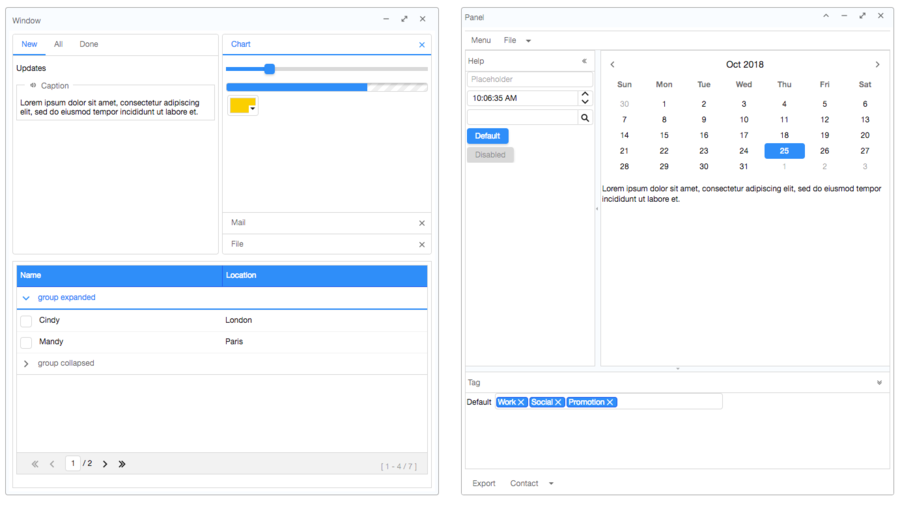
| − | The new default Iceblue theme from 8.5 has brought you with a refreshed, ultra modern look and feel. For users upgrading from an older version, Iceblue Compact is now available bringing you a same refreshed modern look and feel, along with breeze-compatible font size, paddings, and margins. Yes, this means zero code upgrade! | + | The new default Iceblue theme from 8.5 has brought you with a refreshed, ultra-modern look and feel. For users upgrading from an older version, Iceblue Compact is now available in 8.6 bringing you a same refreshed modern look and feel, along with breeze-compatible font size, paddings, and margins. Yes, this means zero code upgrade! |
For theme-pack theme users, all 24 [https://www.zkoss.org/product/zkthemepack theme pack] themes have their corresponding compact theme. To apply a theme, just include the theme pack jar and specify the compact theme name, for example: | For theme-pack theme users, all 24 [https://www.zkoss.org/product/zkthemepack theme pack] themes have their corresponding compact theme. To apply a theme, just include the theme pack jar and specify the compact theme name, for example: | ||
| Line 45: | Line 43: | ||
</source> | </source> | ||
| − | * Each compact theme is named after the original theme name appended with "_c". For example, iceblue_c is the compact version of iceblue theme. | + | * Each compact theme is named after the original theme name appended with "_c". For example, iceblue_c is the compact version of iceblue theme. iceblue_c is by default included in the CE binary; if you use maven, it is available in [https://mavensync.zkoss.org/maven2/org/zkoss/theme/iceblue_c/ this repo folder]. |
[[Image:compact-theme.png | center | 900px]] | [[Image:compact-theme.png | center | 900px]] | ||
| − | Please check them out at [https://www.zkoss.org/ | + | Please check them out at [https://www.zkoss.org/zkthemepackdemo/ Theme Demo] |
| − | = [[ZK_Component_Reference/Input/Checkbox#Mold| | + | = [[ZK_Component_Reference/Input/Checkbox#Mold| iOS Style Switch and Toggle]] = |
<!-- http://tracker.zkoss.org/browse/ZK-3958 --> | <!-- http://tracker.zkoss.org/browse/ZK-3958 --> | ||
{{ZK All}} | {{ZK All}} | ||
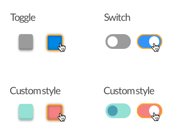
Checkbox now supports 2 new molds: switch mold and toggle mold. | Checkbox now supports 2 new molds: switch mold and toggle mold. | ||
| − | |||
| − | |||
| − | + | [[File:Toggle_Switch.png | center]] | |
| − | [[File: | ||
| − | = [[ZK_Component_Reference/Input/Checkbox| Tri-state Checkbox]] = | + | = [[ZK_Component_Reference/Input/Checkbox#Indeterminate| Tri-state Checkbox]] = |
<!-- http://tracker.zkoss.org/browse/ZK-136 --> | <!-- http://tracker.zkoss.org/browse/ZK-136 --> | ||
{{ZK All}} | {{ZK All}} | ||
In addition to Checked and Unchecked, the Checkbox component now supports indeterminate states. | In addition to Checked and Unchecked, the Checkbox component now supports indeterminate states. | ||
[[File:checkbox-3states.png | center]] | [[File:checkbox-3states.png | center]] | ||
| − | |||
= [[ZK%20Component%20Reference/Essential%20Components/Rating| Give Me a Rating]] = | = [[ZK%20Component%20Reference/Essential%20Components/Rating| Give Me a Rating]] = | ||
| Line 74: | Line 68: | ||
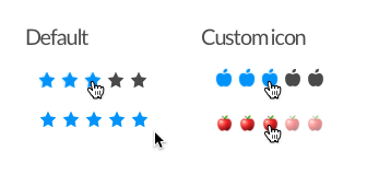
The Rating component allows users to click an icon and rate. It also has read-only and disabled states for presenting rated scores. | The Rating component allows users to click an icon and rate. It also has read-only and disabled states for presenting rated scores. | ||
| − | [[File: | + | [[File:Rating.png | center]] |
= [[ZK%20Component%20Reference/Essential%20Components/Toolbar| Toolbar Accommodates More Buttons]] = | = [[ZK%20Component%20Reference/Essential%20Components/Toolbar| Toolbar Accommodates More Buttons]] = | ||
<!-- http://tracker.zkoss.org/browse/ZK-3179 --> | <!-- http://tracker.zkoss.org/browse/ZK-3179 --> | ||
{{ZK All}} | {{ZK All}} | ||
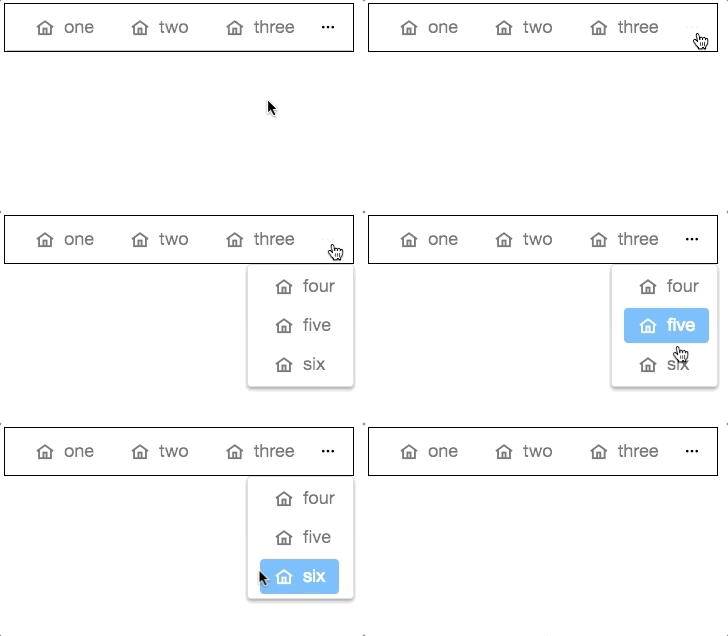
| − | When you set < | + | When you set <code>overflowPopup="true"</code>, a toolbar will display ellipsis (<code>...</code>) on the right. When hovering over the ellipsis, it will display a popup which contains additional selections that aren’t present on the toolbar. |
[[File:Toolbar-overflowPopup.gif | center]] | [[File:Toolbar-overflowPopup.gif | center]] | ||
| − | = [ | + | = [https://github.com/zkoss/zk-mvvm-book/blob/8.0/advanced/using_navigationmodel.md Page Navigation Model]= |
<!-- http://tracker.zkoss.org/browse/ZK-4028 --> | <!-- http://tracker.zkoss.org/browse/ZK-4028 --> | ||
| − | {{ZK | + | {{ZK EE}} |
| − | |||
| − | |||
| + | With the help of [http://www.zkoss.org/javadoc/latest/zk/org/zkoss/zuti/zul/NavigationModel.html NavigationModel] and <code><apply></code>, you can now construct a multi-level page navigation mechanism and navigate among those pages by loading the template. | ||
= [[ZK%20Component%20Reference/Layouts/GoldenLayout| Multi-Screen Layout - Goldenlayout]] = | = [[ZK%20Component%20Reference/Layouts/GoldenLayout| Multi-Screen Layout - Goldenlayout]] = | ||
| Line 101: | Line 94: | ||
<!-- http://tracker.zkoss.org/browse/ZK-3961 --> | <!-- http://tracker.zkoss.org/browse/ZK-3961 --> | ||
{{ZK EE}} | {{ZK EE}} | ||
| − | Set the < | + | Set the <code>mold</code> attribute as <code>knob</code> on the Slider component to enable the slider knob. The slider then acts like a knob presenting the values. The knob can be controlled by dragging the wheel, clicking the mouse and entering a value within the center of the textbox. |
[[File:knob-slider.gif | center]] | [[File:knob-slider.gif | center]] | ||
| − | = [[ZK_Component_Reference/Multimedia_and_Miscellaneous/Camera| | + | = [[ZK_Component_Reference/Multimedia_and_Miscellaneous/Camera| Take a photo - Camera]] = |
<!-- http://tracker.zkoss.org/browse/ZK-3930 --> | <!-- http://tracker.zkoss.org/browse/ZK-3930 --> | ||
{{ZK EE}} | {{ZK EE}} | ||
| + | [[File: Camera.png | center]] | ||
You can now include the Camera component in your app to allow users taking snapshots. Note that the camera has to be accessible by the browser. | You can now include the Camera component in your app to allow users taking snapshots. Note that the camera has to be accessible by the browser. | ||
| − | |||
| − | |||
= [[ZK_Component_Reference/Multimedia_and_Miscellaneous/Camera|Record a Clip]] = | = [[ZK_Component_Reference/Multimedia_and_Miscellaneous/Camera|Record a Clip]] = | ||
{{ZK EE}} | {{ZK EE}} | ||
| − | The Camera component can also record a video clip. | + | The Camera component can also record a video clip. It also allows you to preview and upload recorded file. |
| − | |||
| − | |||
= [[ZK_Component_Reference/Multimedia_and_Miscellaneous/Video|Video Player]] = | = [[ZK_Component_Reference/Multimedia_and_Miscellaneous/Video|Video Player]] = | ||
{{ZK EE}} | {{ZK EE}} | ||
| − | With this component, you can build your own youtube or | + | The Video component allows you to play videos in your browser. With this component, you can even build your own youtube or develop an online tutorial. |
[[Image:video-player.gif | center]] | [[Image:video-player.gif | center]] | ||
| − | + | = [[ZK%20Component%20Reference/Multimedia%20and%20Miscellaneous/Cropper| Crop an Uploaded Image - Cropper]] = | |
| − | = [[ZK%20Component%20Reference/Multimedia%20and%20Miscellaneous/Cropper| Crop an Uploaded Image]] = | ||
<!-- http://tracker.zkoss.org/browse/ZK-3962 --> | <!-- http://tracker.zkoss.org/browse/ZK-3962 --> | ||
{{ZK EE}} | {{ZK EE}} | ||
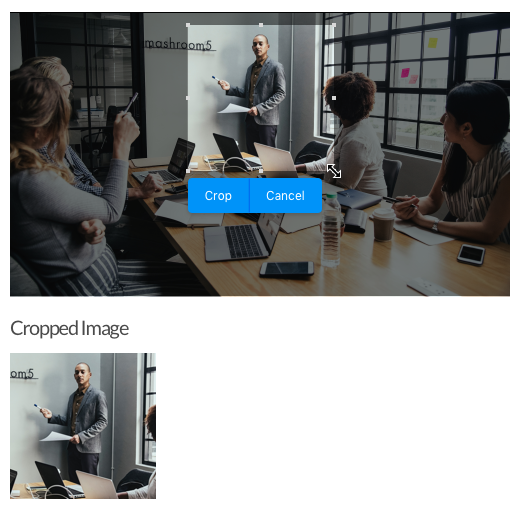
| − | This component allows users to crop | + | This component allows users to crop the selected range of an image. The developer can also process the cropped image further, such as showing the cropped image on a page. |
| − | |||
| − | |||
| + | [[File:cropper.png | center]] | ||
= [[ZK%20Component%20Reference/Layouts/Organigram| Show Your Organization - Organigram]] = | = [[ZK%20Component%20Reference/Layouts/Organigram| Show Your Organization - Organigram]] = | ||
{{ZK EE}} | {{ZK EE}} | ||
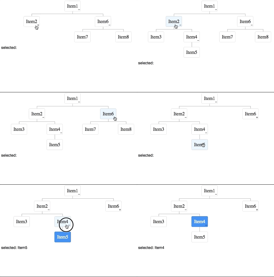
| − | + | This component can render a structured diagram with a <code>TreeModel</code>. | |
[[Image:organigram.gif | center]] | [[Image:organigram.gif | center]] | ||
| − | = [[ZK%20Component%20Reference/Input/Signature| Sign Here, Please]] = | + | = [[ZK%20Component%20Reference/Input/Signature| Sign Here, Please - Signature Component]] = |
<!-- http://tracker.zkoss.org/browse/ZK-3959 --> | <!-- http://tracker.zkoss.org/browse/ZK-3959 --> | ||
{{ZK EE}} | {{ZK EE}} | ||
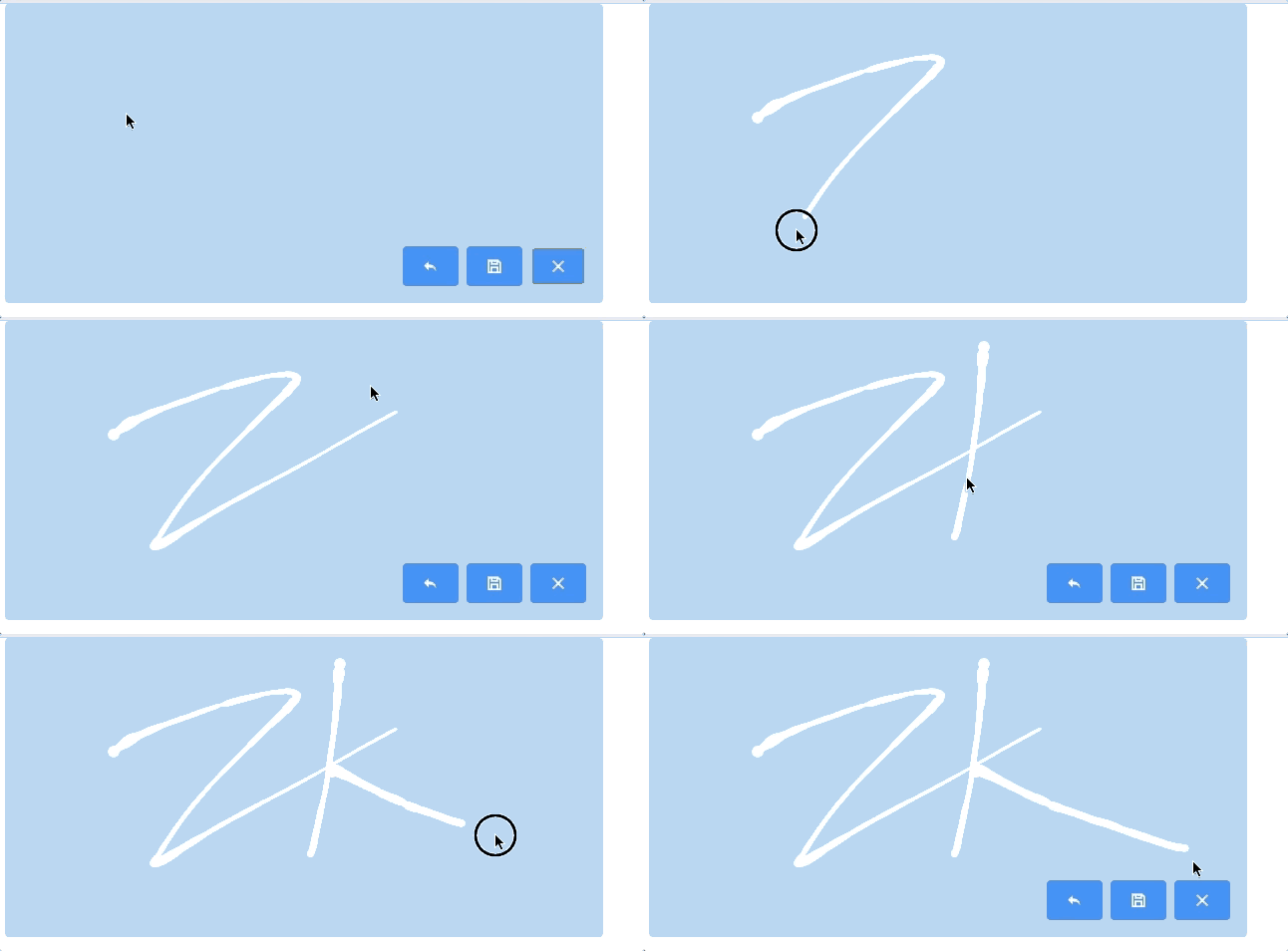
| − | [[ZK_Component_Reference/Input/Signature| Signature]] supports | + | The [[ZK_Component_Reference/Input/Signature| Signature]] component supports the signature pad on both the desktop and mobile browser. Developers can select the pen size, color, background, etc; while end users can save, undo, or clear their signatures. |
| − | |||
[[File:sinature.gif | center]] | [[File:sinature.gif | center]] | ||
| − | |||
= [[ZK%20Component%20Reference/Multimedia%20and%20Miscellaneous/Barcode| Display a Barcode]] = | = [[ZK%20Component%20Reference/Multimedia%20and%20Miscellaneous/Barcode| Display a Barcode]] = | ||
{{ZK EE}} | {{ZK EE}} | ||
| − | A barcode component | + | A barcode component generates the barcode at the browser, and decodes it at the server side. It supports QR Code and 18 1D barcode types. |
| − | [[Image:qrcode.png]] | + | [[Image:qrcode.png | center]] |
<source lang="xml" > | <source lang="xml" > | ||
<barcode type="qr" value="https://www.zkoss.org/" height="100px"/> | <barcode type="qr" value="https://www.zkoss.org/" height="100px"/> | ||
</source> | </source> | ||
| − | [[Image:code128.png]] | + | [[Image:code128.png | center]] |
<source lang="xml" > | <source lang="xml" > | ||
<barcode type="code128" value="https://www.zkoss.org/" height="100px"/> | <barcode type="code128" value="https://www.zkoss.org/" height="100px"/> | ||
</source> | </source> | ||
| − | |||
= [[ZK_Component_Reference/Multimedia_and_Miscellaneous/BarcodeScanner| Scan a Barcode]] = | = [[ZK_Component_Reference/Multimedia_and_Miscellaneous/BarcodeScanner| Scan a Barcode]] = | ||
{{ZK EE}} | {{ZK EE}} | ||
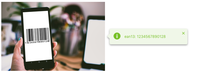
| − | A Barcodescanner component is used to scan and decode the barcode at the client side. | + | A Barcodescanner component is used to scan and decode the barcode at the client side. It supports QR Code and nine 1D barcode types. |
| − | |||
| − | |||
| + | [[File:Show_Barcode.png | center]] | ||
<br/> | <br/> | ||
| Line 178: | Line 162: | ||
| − | == [[ | + | == Improved Rendering Speed == |
| + | In each new release we try to optimize our framework further to provide you with the best performance and usability. In ZK 8.6 we have specifically improved the rendering speed when opening a tree node; and when changing the model of a chosenbox. | ||
| + | <!-- | ||
| + | http://tracker.zkoss.org/browse/ZK-3978 | ||
| + | http://tracker.zkoss.org/browse/ZK-3986 | ||
| + | --> | ||
| + | |||
| + | == [[ZK_Component_Reference/Essential_Components/Menu/Menupopup#Highlight_position | Guide Users with a Pop-up Menuitem]] == | ||
{{ZK All}} | {{ZK All}} | ||
| − | If you | + | If you wish to guide new users to click a specific menuitem or open a menupopup, ZK provides a way to hint them by highlighting the specific item: |
[[File:menuitem-setactive.gif | center]] | [[File:menuitem-setactive.gif | center]] | ||
| Line 189: | Line 180: | ||
</source> | </source> | ||
| − | + | == Packaging change: (Servlet 3) Web Fragment Rearranged== | |
| − | == Web Fragment == | + | Web-fragment was included by default in the previous versions. We now make it more flexible and separated ZK web fragment into [http://mavensync.zkoss.org/eval/org/zkoss/zk/zkwebfragment/ another artifact], so that you can decide to include it or not depending on your project requirement. |
| − | |||
| − | We now | ||
<!-- http://tracker.zkoss.org/browse/ZK-4022 --> | <!-- http://tracker.zkoss.org/browse/ZK-4022 --> | ||
| + | = Summary= | ||
| + | ZK 8.6 contains versatile new components that are exclusively designed for modern users with improved usability, functions, and features. We hope you find ZK 8.6 useful! Feel free to [https://www.zkoss.org/support/about/contact tell us] which new component you like the most. We look forward to hearing from you! | ||
| − | + | <br/> | |
| − | + | <br/> | |
| − | < | ||
| − | |||
| − | |||
| − | |||
| − | |||
| − | |||
<div style="float: left;"><imagelink link="http://www.zkoss.org/download/zk" image="/_w/images/0/00/Download-zk-7.png" /></div> | <div style="float: left;"><imagelink link="http://www.zkoss.org/download/zk" image="/_w/images/0/00/Download-zk-7.png" /></div> | ||
| − | |||
<br/> | <br/> | ||
<br/> | <br/> | ||
| − | + | [[Category:New Features]] | |
| − | |||
{{Template:CommentedSmalltalk_Footer_new| | {{Template:CommentedSmalltalk_Footer_new| | ||
|name=Potix Corporation | |name=Potix Corporation | ||
}} | }} | ||
Latest revision as of 04:39, 20 January 2022
Hawk Chen, Engineer, Potix Corporation
Nov. 7, 2018
ZK 8.6.0
Introduction
Having rich and user-friendly components has been one of the main reasons that developers love ZK. Now, with the release of the 8.6 version, we aim at creating more integrated and modernernized features that excite your users. You will come across enhanced multimedia and input widgets such as video clips, image cropper, toggle switch, signature and slider knob.
Expect a better look and feel of different applications with improved efficiency. With Iceblue Compact, you can upgrade your ZK 8 or older ZK application to a brand new refreshing look and feel without any code change!
Highlights:
- Breeze-compatible Compact Theme
- 10+ New Components and Molds
View Release Notes.
Download and Demo
Highlighted Features
Refresh Theme without Code Change - Compact Theme
The new default Iceblue theme from 8.5 has brought you with a refreshed, ultra-modern look and feel. For users upgrading from an older version, Iceblue Compact is now available in 8.6 bringing you a same refreshed modern look and feel, along with breeze-compatible font size, paddings, and margins. Yes, this means zero code upgrade!
For theme-pack theme users, all 24 theme pack themes have their corresponding compact theme. To apply a theme, just include the theme pack jar and specify the compact theme name, for example:
<library-property>
    <name>org.zkoss.theme.preferred</name>
    <value>iceblue_c</value>
</library-property>
- Each compact theme is named after the original theme name appended with "_c". For example, iceblue_c is the compact version of iceblue theme. iceblue_c is by default included in the CE binary; if you use maven, it is available in this repo folder.
Please check them out at Theme Demo
iOS Style Switch and Toggle
- Available for ZK:
-

Checkbox now supports 2 new molds: switch mold and toggle mold.
Tri-state Checkbox
- Available for ZK:
-

In addition to Checked and Unchecked, the Checkbox component now supports indeterminate states.
Give Me a Rating
- Available for ZK:
-

The Rating component allows users to click an icon and rate. It also has read-only and disabled states for presenting rated scores.
Toolbar Accommodates More Buttons
- Available for ZK:
-

When you set overflowPopup="true", a toolbar will display ellipsis (...) on the right. When hovering over the ellipsis, it will display a popup which contains additional selections that aren’t present on the toolbar.
- Available for ZK:
-

With the help of NavigationModel and <apply>, you can now construct a multi-level page navigation mechanism and navigate among those pages by loading the template.
Multi-Screen Layout - Goldenlayout
- Available for ZK:
-

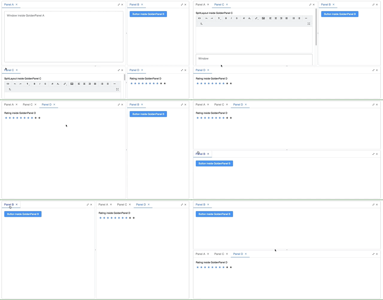
GoldenLayout is a multi-layout, which displays panels as a docker type. You are able to drag a panel to dock at 4 regions (north, east, south, west) or to stack on another panel. This component is suitable and provides for a workspace-like interface.
Slider Knob
- Available for ZK:
-

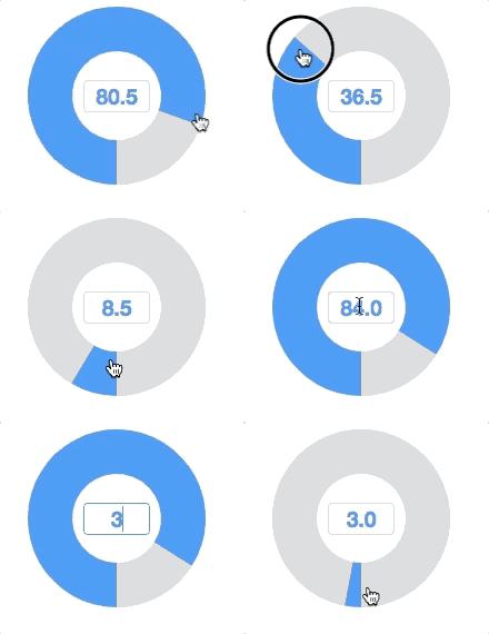
Set the mold attribute as knob on the Slider component to enable the slider knob. The slider then acts like a knob presenting the values. The knob can be controlled by dragging the wheel, clicking the mouse and entering a value within the center of the textbox.
Take a photo - Camera
- Available for ZK:
-

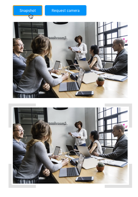
You can now include the Camera component in your app to allow users taking snapshots. Note that the camera has to be accessible by the browser.
Record a Clip
- Available for ZK:
-

The Camera component can also record a video clip. It also allows you to preview and upload recorded file.
Video Player
- Available for ZK:
-

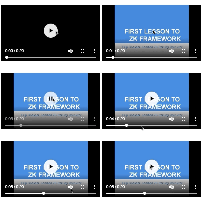
The Video component allows you to play videos in your browser. With this component, you can even build your own youtube or develop an online tutorial.
Crop an Uploaded Image - Cropper
- Available for ZK:
-

This component allows users to crop the selected range of an image. The developer can also process the cropped image further, such as showing the cropped image on a page.
Show Your Organization - Organigram
- Available for ZK:
-

This component can render a structured diagram with a TreeModel.
Sign Here, Please - Signature Component
- Available for ZK:
-

The Signature component supports the signature pad on both the desktop and mobile browser. Developers can select the pen size, color, background, etc; while end users can save, undo, or clear their signatures.
Display a Barcode
- Available for ZK:
-

A barcode component generates the barcode at the browser, and decodes it at the server side. It supports QR Code and 18 1D barcode types.
<barcode type="qr" value="https://www.zkoss.org/" height="100px"/>
<barcode type="code128" value="https://www.zkoss.org/" height="100px"/>
Scan a Barcode
- Available for ZK:
-

A Barcodescanner component is used to scan and decode the barcode at the client side. It supports QR Code and nine 1D barcode types.
Other Enhancements
Improved Rendering Speed
In each new release we try to optimize our framework further to provide you with the best performance and usability. In ZK 8.6 we have specifically improved the rendering speed when opening a tree node; and when changing the model of a chosenbox.
Guide Users with a Pop-up Menuitem
- Available for ZK:
-

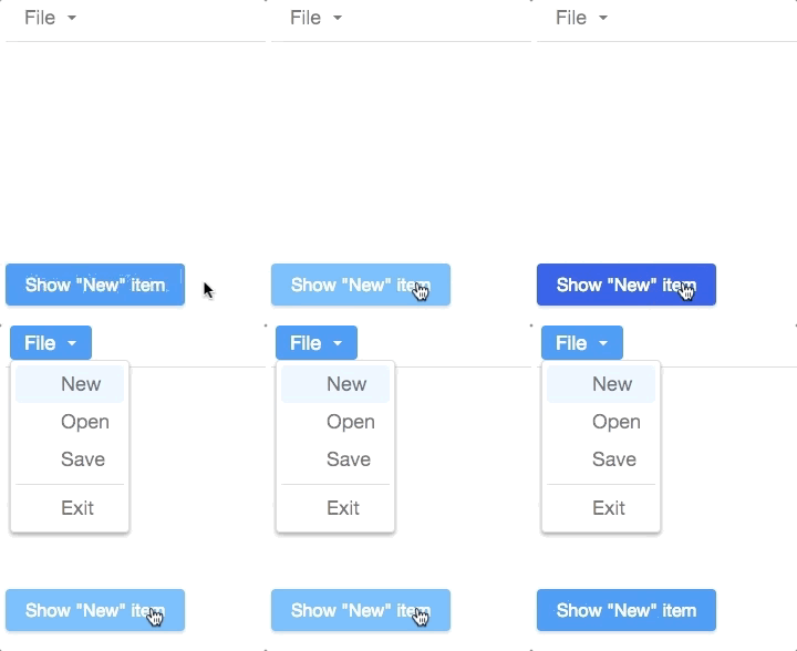
If you wish to guide new users to click a specific menuitem or open a menupopup, ZK provides a way to hint them by highlighting the specific item:
menu.getMenupopup().setActive(i);
Packaging change: (Servlet 3) Web Fragment Rearranged
Web-fragment was included by default in the previous versions. We now make it more flexible and separated ZK web fragment into another artifact, so that you can decide to include it or not depending on your project requirement.
Summary
ZK 8.6 contains versatile new components that are exclusively designed for modern users with improved usability, functions, and features. We hope you find ZK 8.6 useful! Feel free to tell us which new component you like the most. We look forward to hearing from you!
Comments
| Copyright © Potix Corporation. This article is licensed under GNU Free Documentation License. |


