Signature
Hawk Chen, Engineer, Potix Corporation
2018
ZK 8.6.0
Introduction
Rich and reusable components are the main reason that people adopt ZK. In 8.6 release, we focus on making components more powerful, we create several new components for multimedia and enhance some components to support more features.
Highlighted features:
- 8 new components
- Compact theme
Download and Demo
Highlighted Features
Refresh Theme without Change - Compact Theme
- Available for ZK:
-

The new default theme iceblue is great. But we also hear from some users' voice, we now build a compact theme to let you refresh your application's looking without modification.
Please check them at Theme Demo
Video Player
- Available for ZK:
-

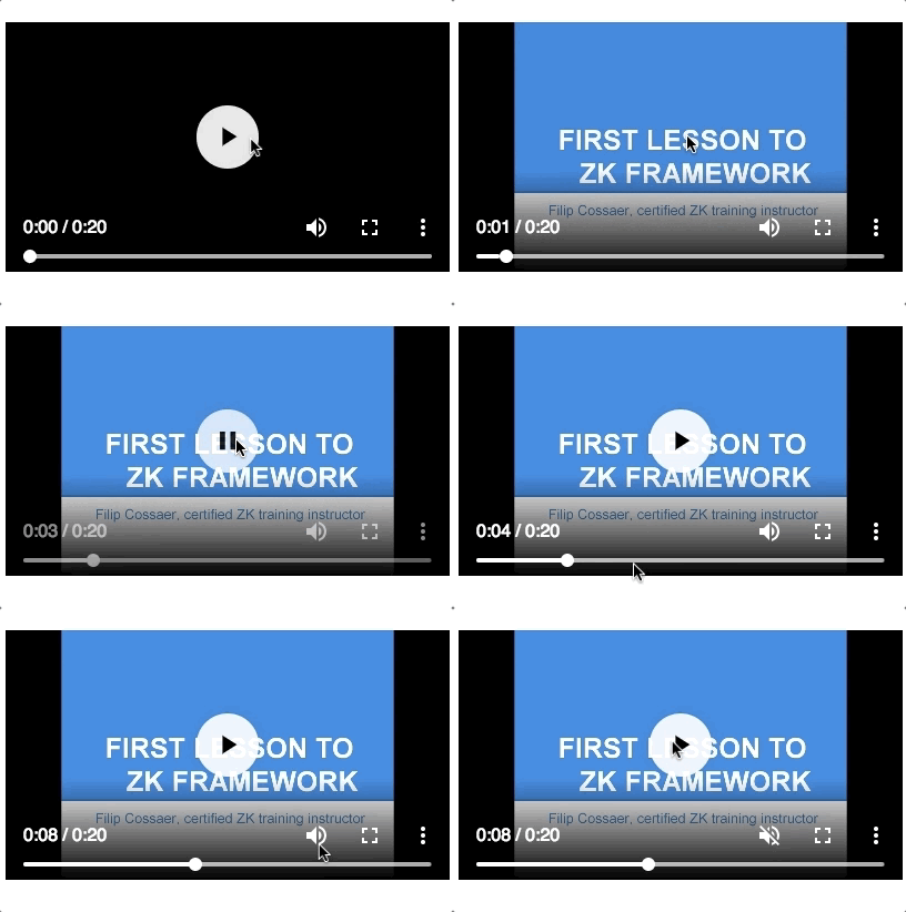
With this component, you can build your own youtube or a online school.
Ios Style Switch and Toggle
- Available for ZK:
-

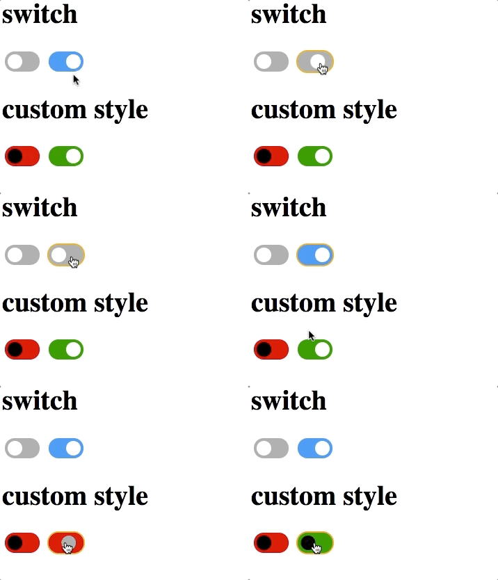
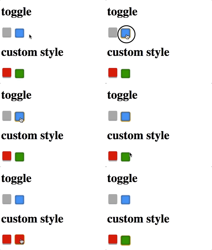
Checkbox supports 2 new molds:
Ios Style Switch
Toggle
Check Component Reference.
3 States Checkbox
- Available for ZK:
-

Checkbox supports intermediate states:
Knob-like Slider
- Available for ZK:
-

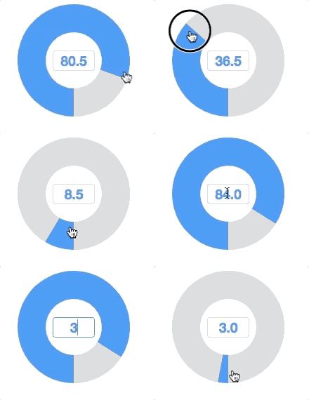
Set the mold attribute with knob will enable knob slider. So the slider can act as a normal knob. You can controll by wheel, drag, click and enter a value to the textbox in the center.
Toolbar Accommodates More Buttons
- Available for ZK:
-

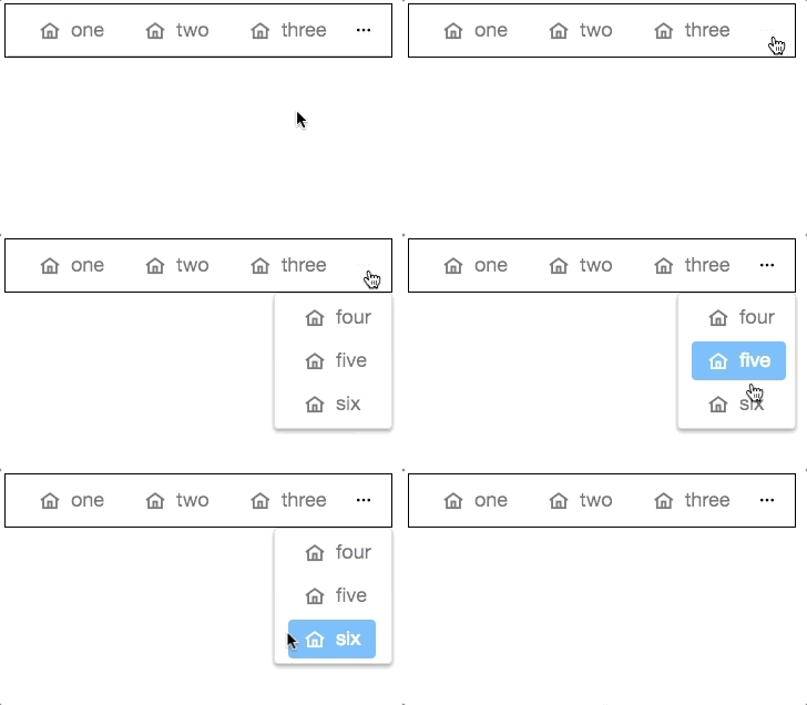
When overflowPopup="true", a toolbar will have a ... symbol that shows a popup which contains those buttons weren't able to fit in the toolbar.
- Available for ZK:
-

Multi-Screen Layout - Goldenlayout
- Available for ZK:
-

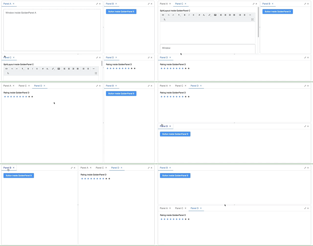
GoldenLayout is a layout container which layouts panels as docker type. You can drag a panel to dock at 4 regions (north, east, south, west) or to stack on another panel. This component is suitable for building a workspace like interface.
Take a Photo - Camera
- Available for ZK:
-

Record a Clip
- Available for ZK:
-

Show Your Organization - Organigram
- Available for ZK:
-

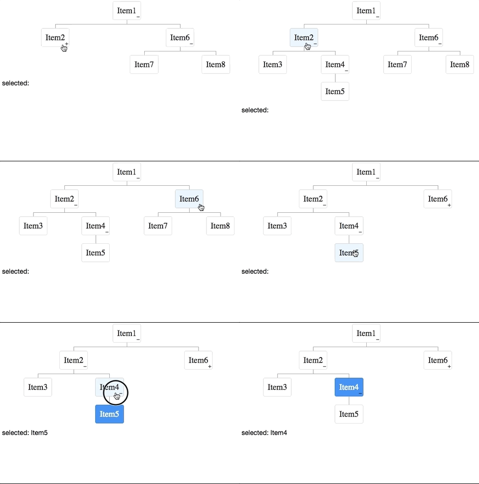
The component can render a organizational chart upon a TreeModel.
Sign Here, Please
- Available for ZK:
-

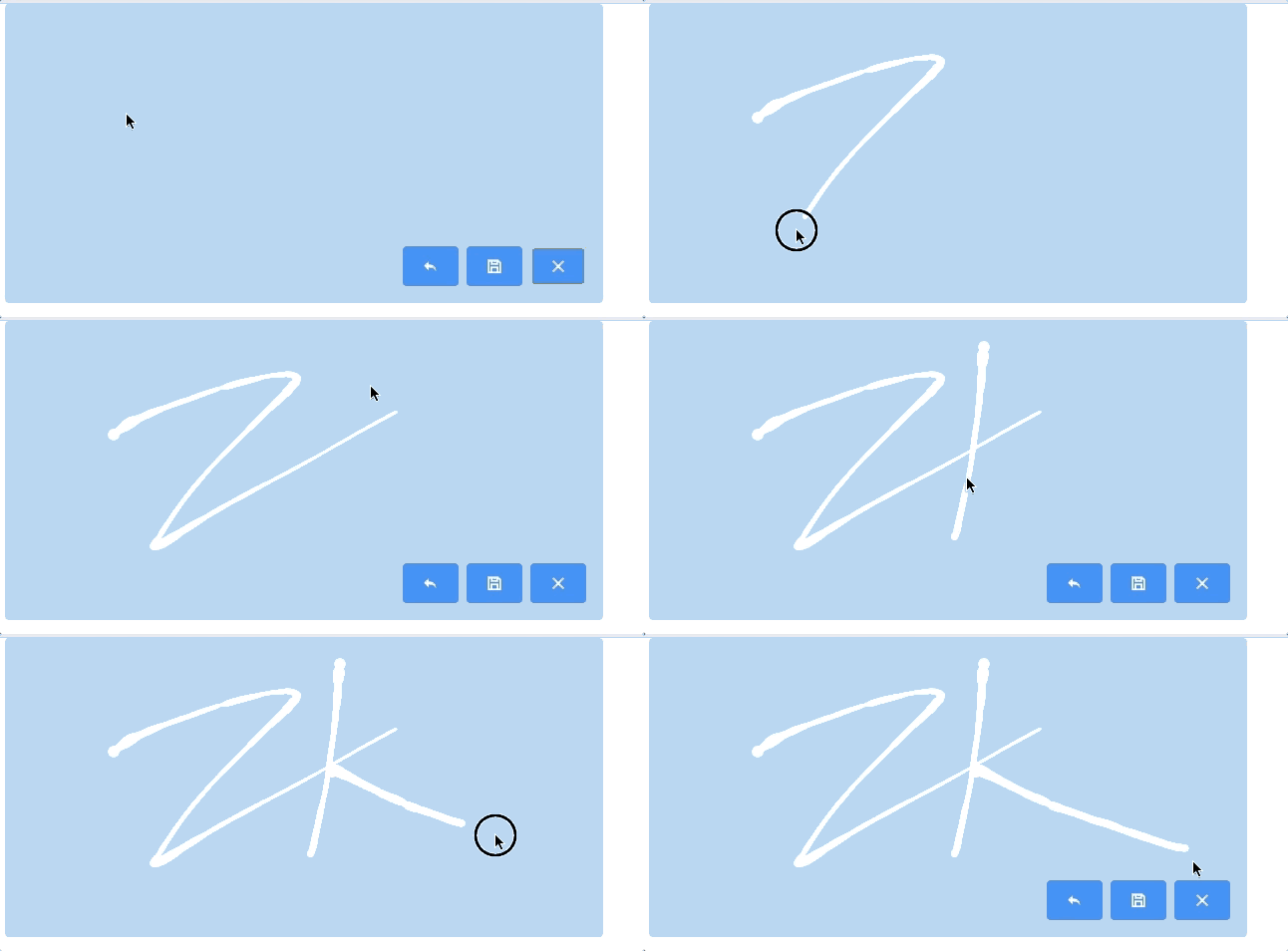
Signature supports singature pad on the desktop and mobile browsers. Developers can setup pen size, pen color, and background color etc. Users can undo, save and clear their signatres.
Give Me a Rating
- Available for ZK:
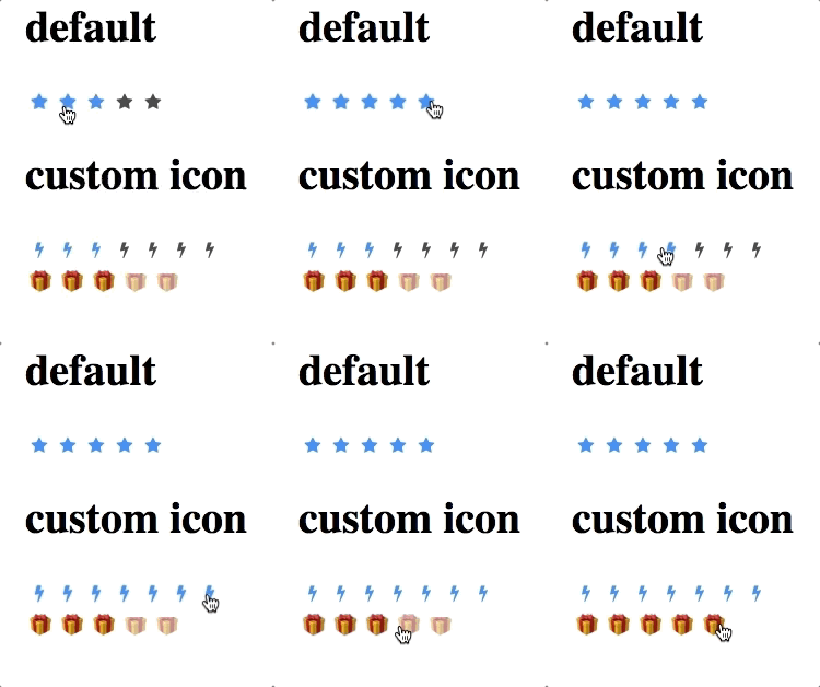
-

Crop a Uploaded Image
- Available for ZK:
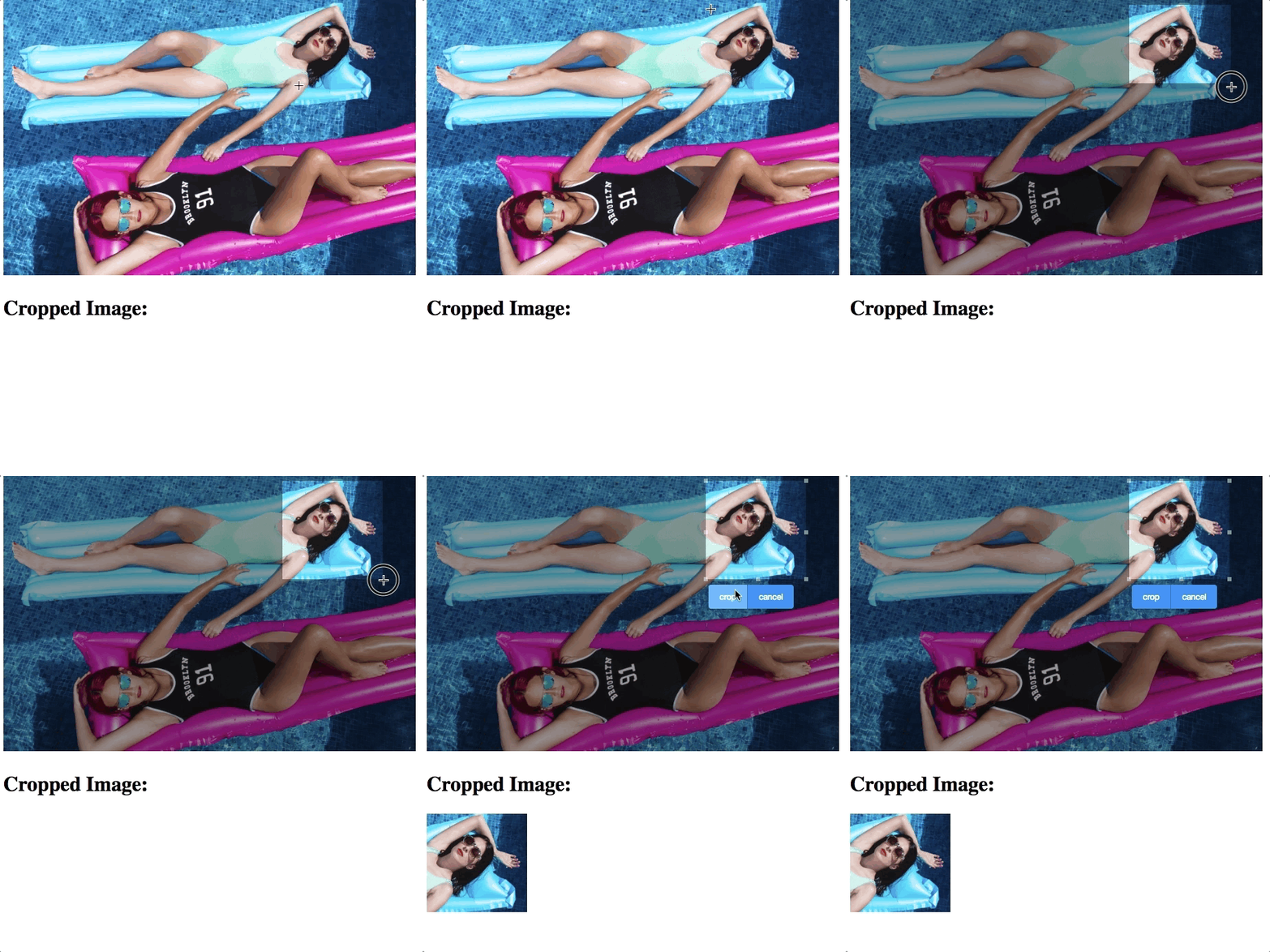
-

Display and Scan a Barcode
- Available for ZK:
-

Other Enhancements
Guide Users with a Pop-up Menuitem
- Available for ZK:
-

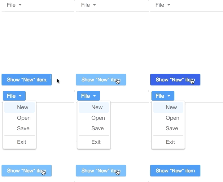
If you want to guide new users to click a menuitem or open a menupopup for them, ZK provide a method to pop up the menuitem in front of users.
menu.getMenupopup().setActive(i);
Web Fragment
- Available for ZK:
-

We now separate ZK web fragment support into another artifact, so that you can decide to include it or not according to your requirement.
Improved Rendering Speed
We improve the rendering speed when opening a tree node and a model change of a chosenbox.
Summary
ZK is made by Java developers for Java developers; continue bringing technology innovations to enterprise Java web development has always been our top priority. ZK 8.5 provides a great balance between the required server-side simplicity, security, and integrity and the client-side usability, look, and feel.
Join us this fall and harvest Javascript from Java roots!
ZK grows with you. Feel free to share with us your feedback or suggestion.
Comments
| Copyright © Potix Corporation. This article is licensed under GNU Free Documentation License. |


