How to Apply Responsive Design
Hawk Chen, Engineer, Potix Corporation
November 28, 2012
6.5.0
Introduction to Responsive Web Design
When talking about "Responsive Web Design", most people usually cite the classical article written by Ethan Marcotte [1]. We also encourage you to read it if you don't have any idea about "Responsive Web Design". He might be the first one (as I know) who talks about this topic and addresses the phrase "Responsive Web Design". In Marcotte's article, this phrase is inspired from "responsive architecture" which can respond to the presence of people passing through it. As more and more devices can visit a website, our website (or web application) requires responsive web design.
"Responsive web design" is not a new technique. It's a design approach that enables the website to be viewed nicely by a wide range of devices. According to Marcotte's article, there are 3 elements we can use to fulfill this design.
- Fluid Grid. [2] A Grid is a two-dimensional structure used to organize dense content. [3] "Fluid" means each grid's size and positioning will change upon the size of the device’s display.
- Flexible Images.[4] Browsers don't re-size images naturally but we can use CSS to make it flexible to width.
- Media Query.[5] CSS 3 contains a media query to allow us inspect the device's physical characteristics, e.g. width. We can use it to load different CSS upon different media.
ZK's Support to Responsive Design
ZK supports responsive web design and improves components for tablet devices.[6] We also add client side related attributes for many components to help developers optimize the user experience. If ZK detects the client device (by user-agent) is a tablet, it sets viewport size to device's width and does not allow scaling its screen by meta tags. [7] as scaling the screen usually breaks the layout.
<meta name="viewport" content="width=device-width, initial-scale=1.0, maximum-scale=1.0, user-scalable=no">
In following sections, we will talk about features that help developers achieve responsive web design.
Flexible Components
In Marcotte's article, fluid grid and flexible images are two basic elements of responsive web design. ZK's layout components are already flexible and like fluid grid that can change upon a device's width. For other components, we can use hflex and vflex [8] to make them become flexible upon different device's screen. The "hflex" and "vflex" indicate the horizontal and vertical "flexibility" of a component. "Flexibility" refers to how a component's parent should distribute the remaining empty space among its children components. We'll demonstrate an example in the next chapter.
CSS 3 Media Query
We can also use CSS 3's media query in a zul to apply different style according to different device's characteristics. To customize a component's style, we suggest you to read ZK Style Guide.
CSS 3 media query syntax example
<zk>
<style>
@media screen and (max-width: 1024px) {
	.style-for-larger-screen {
		...
	}
}
@media screen and (max-width: 750px) {
	.style-for-smaller-screen {
		...
	}
}
</style>
</zk>
<style>is a component which allows you write CSS class inside it. Please refer to ZK Developer's Reference/Theming and Styling/CSS Classes and Styles.
Programmatic Media Query
If we want to control components according to a device's characteristic or detect a device's orientation, we must listen to ClientInfoEvent. This event is only sent when it's registered at the root component. We can get various client informations throughout this event object. For example getOrientation() returns "landscape" or "portrait" to indicate the device's orientation. getDesktopWidth() returns the height of browser's inner displaying area, and it's usually smaller than the value returned by getScreenWidth().
Example in data binding
<window onClientInfo="@command('updateDeviceStatus', orientation=event.orientation)">
...
</window>
Mobile Browser Detection
We can detect the client is a mobile device or not by calling methods of Executions.
// Detect if client is mobile device (such as Android or iOS devices)
public boolean isMobile(){
	return Executions.getCurrent().getBrowser("mobile") !=null;
}
Example
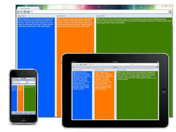
Fluid Layout
ZK provides a component's attributes to set flexibility of width or height instead of giving components a fixed height and/or width in pixels.
For example,
<hlayout vflex="1">
	<window title="Column 25%" vflex="1" hflex="1" sclass="column1" border="normal">
			toffee candy canes cheesecake gummies apple pie. Pie cupcake cheesecake sugar plum tart donut
			bear claw caramels. Sesame snaps candy candy faworki sesame snaps chocolate wypas cheesecake.
			Cupcake cupcake chupa chups dragée bonbon cotton candy pudding.
	</window>
	<window title="Column 25%" vflex="1" hflex="1" sclass="column2" border="normal">
			toffee candy canes cheesecake gummies apple pie. Pie cupcake cheesecake sugar plum tart donut
			bear claw caramels. Sesame snaps candy candy faworki sesame snaps chocolate wypas cheesecake.
			Cupcake cupcake chupa chups dragée bonbon cotton candy pudding.
	</window>
	<window title="Column 50%" vflex="1" hflex="2" sclass="column3" border="normal">
			toffee candy canes cheesecake gummies apple pie. Pie cupcake cheesecake sugar plum tart donut
			bear claw caramels. Sesame snaps candy candy faworki sesame snaps chocolate wypas cheesecake.
			Cupcake cupcake chupa chups dragée bonbon cotton candy pudding.
	</window>
</hlayout>
In the above example, we use the attributes vflex and hflex to make width and height have proportional flexibility according to the screen size of different devices.
Mondrian Pattern
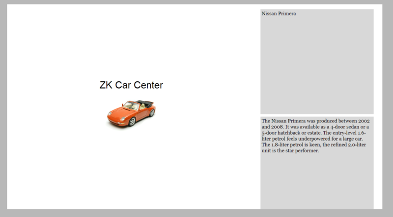
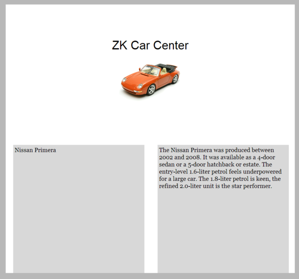
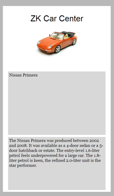
There are many popular responsive web design patterns on the internet. Here we show how to implement one pattern of them: Mondrian pattern. I think it is named because this pattern's layout is similar with Piet Mondrian's famous painting, Composition [9], which splits a picture into multiple rectangles. This pattern splits a screen into 3 rectangles. When the screen's width becomes smaller, it changes the arrangement and width of rectangles to be adaptive.
The pattern has 3 rectangles. When screen becomes smaller, rectangles on the right flow on the bottom of the rectangle on the left. We can use 2 Hlayouts to implement this fluid style. The first Hlayout is the root component which encloses 3 rectangle areas; the second Hlayout inside the first one encloses two rectangles on the right. A Hlayout's inner DOM structure uses a HTML <div> to enclose each component inside it and each inner HTML <div< is applied with a CSS class, z-hlayout-inner [10]. This inner HTML div controls the width and arrangements of components inside it. Hence, we need to adjust inner div's width by overriding z-hlayout-inner with CSS 3 media query.
Extracted from adaptive.zul (view full source)
<zk>
<style>
.first-layout{
	background-color:black
}

.second-layout{
	height: 100%;
}

.first-layout>.z-hlayout-inner:first-child {
	width: 66%;
    height: 100%;
}
.first-layout>.z-hlayout-inner:last-child {
	width: 33%;
    height: 100%;
}

.second-layout>.z-hlayout-inner{
    width: 100%;
    height: 50%;
    display:block;
}

@media screen and (max-width: 1024px) {
.first-layout>.z-hlayout-inner:first-child {
		width: 100%;
	    height: 50%;
	}
.first-layout>.z-hlayout-inner:last-child {
		width: 100%;
	    height: 50%;
    	display:block;
	}
.second-layout>.z-hlayout-inner{
	    width: 50%;
	    height: 100%;
	    display:inline-block;
	}
}

@media screen and (max-width: 750px) {
.first-layout>.z-hlayout-inner:first-child {
		width: 100%;
	    height: 33%;
	}
.first-layout>.z-hlayout-inner:last-child {
		width: 100%;
	    height: 66%;
	}
.second-layout>.z-hlayout-inner{
	    width: 100%;
	    height: 50%;
	    display:block;
	}
}

</style>
	<hlayout vflex="1" hflex="1" sclass="first-layout">
		<vbox width="100%" height="100%" pack="center" align="center">
			<label sclass="title">ZK Car Center</label>
			<image src="car1.png"/>
		</vbox>
		<hlayout sclass="second-layout">
			<div sclass="description-area" height="100%">
				<label sclass="description">
				Nissan Primera
				</label>
			</div>
			<div sclass="description-area" height="100%">
				<label sclass="description">
				The Nissan Primera was produced between 2002 and 2008. It was available as a 4-door sedan
				or a 5-door hatchback or estate.
				The entry-level 1.6-liter petrol feels underpowered for a large car. The 1.8-liter petrol is keen,
				the refined 2.0-liter unit is the star performer.
				</label>
			</div>
		</hlayout>
	</hlayout>
</zk>
- Line 3,7, 60, 65: For clearness, we apply CSS class "first-layout" on the outermost Hlayout which contains Vbox and "second-layout" on inner Hlayout which contains two Div.
- Line 12, 16: If width is over 1024px, we set left inner div's width to 66% and right inner div's to 33% of first-layout Hlayout.
- Line 26,31,34: When the screen becomes a little narrower, we move the two rectangles on the right to the bottom by setting
display:block. - Line 43, 55: When the screen's width is smaller than 750px, we arrange all rectangles to vertical order by setting
display:blockto two z-hlayout-inner of inner Hlayout.
Floating Sidebar
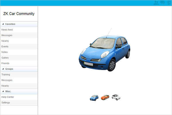
It's very common in responsive web design that left side menu in a page becomes a floating sidebar when you visit with a mobile device for its narrow screen width. The example application we present here has two kinds of layout, one is "fixed menu" for a PC's browser or a mobile device's browser in "landscape" orientation. The left side menu is always visible.
In center area, we use a Cardlayout [11]component and this component supports different ways to switch images for PC and mobile's browser. In a PC browser, users can click the below small icons to switch the image. In a mobile browser, users can switch it by swiping with fingers.
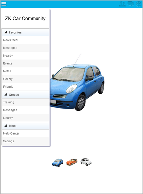
The other layout is "floating menu" for a mobile device's browser in "portrait" orientation. There is no menu on left side, but a menu icon button appears at header on the left. Click the button can toggle floating menu's visibility.
The example application changes its layout in following rules:
- When a user visits with a PC's browser or a mobile browser in "landscape" orientation, the application displays "fixed menu".
- When a user rotate a mobile browser orientation to "portrait", it switches to "floating menu".
This example uses a Borderlayout, and its West contains a menu inside a Window. The fixed or floating menu is achieved by switching Window's mode between "embedded" and "overlapped". The main idea of this example is to switching component's visibility upon the detection of browser's orientation and desktop's width.
Extracted from original sidebar.zul (view full source)
	<window apply="org.zkoss.bind.BindComposer" width="100%" height="100%"
	onClientInfo="@command('updateClientInfo', width=event.desktopWidth, orientation=event.orientation)"
		viewModel="@id('vm') @init('org.zkoss.document.SidebarVM')">

		<borderlayout>
			<north height="28px" sclass="header">
				<hbox width="100%">
					<button sclass="menu-button" visible="@bind(vm.menuAreaWidth eq '0px')"
						image="menu.png"
						onClick='@command("toggleMenu")' />
					<!-- other icons-->
				</hbox>
			</north>
			<west width="@load(vm.menuAreaWidth)">
				<window mode="@load(vm.windowMode)" visible="@bind(vm.floatMenuVisible)" width="200px" top="35px" left="10px">
					<!-- menu -->
				</window>
			</west>
			<center>
				<!-- content area, other components -->
			</center>
		</borderlayout>
	</window>
- Line 2: Passing
ClientInfoEvent's property (orientation and desktop's width) in a command binding for a ViewModel to update the layout. - Line 8: If West's width is 0px, it means we are in floating menu layout. The menu control button should be visible.
- Line 10: Use a command binding to toggle the menu's visibility.
- Line 14: We shrink West's width to 0px to make it invisible when it's under floating menu layout.
- Line 15: We switch Window's mode between "embedded" and "overlapped".
Extracted from SidebarVM.java (view full source)
public class SidebarVM {

	private boolean floatingMenuVisible = true;
	private boolean isMobile = false;
	private String orientation;
	private String windowMode = "embedded";
	private String menuAreaWidth= "200px";

	@AfterCompose
	public void init(){
		ServletRequest request = ServletFns.getCurrentRequest();
		// Detect if client is mobile device (such as Android or iOS devices)
		isMobile = Servlets.getBrowser(request, "mobile") != null;
		if (isMobile){
			toFloatingMenu();
		}
	}

	@Command
	@NotifyChange("floatingMenuVisible")
	public void toggleMenu(){
		floatingMenuVisible = !floatingMenuVisible;
	}

	@Command
	@NotifyChange({"windowMode","menuAreaWidth","floatingMenuVisible"})
	public void updateClientInfo(@BindingParam("orientation") String orientation, @BindingParam("width")int width ){
		if (isMobile){
			if (!orientation.equals(this.orientation)){
				this.orientation = orientation;
				if (orientation.equals("protrait") || width < 800){
					toFloatingMenu();
				}else{
					toFixedMenu();
				}
			}
		}
	}

	private void toFloatingMenu(){
		floatingMenuVisible = false;
		windowMode = "overlapped";
		menuAreaWidth = "0px";
	}

	private void toFixedMenu(){
		floatingMenuVisible = true;
		windowMode = "embedded";
		menuAreaWidth = "200px";
	}
}
- Line 10: The method detects the browser to initialize the layout.
- Line 21: Toggle floating menu's visibility.
- Line 27: Each time when users change the client's status like rotating the device, the method update the layout according to orientation and width.
- Line 40: Set components' attribute for floating menu layout.
- Line 46: Set components' attribute for fixed menu layout.
Summary
ZK provides flexible layout, components and media query to support users for responsive web design. For experienced or new ZK users, they just can easily turn their web application to support multiple devices and keep using same component set with a little extra work.
References
- ↑ http://www.alistapart.com/articles/responsive-web-design/
- ↑ http://www.designinfluences.com/fluid960gs/
- ↑ http://developer.yahoo.com/yui/grids/
- ↑ http://unstoppablerobotninja.com/entry/fluid-images
- ↑ http://www.w3.org/TR/css3-mediaqueries/
- ↑ You can view details of component's enhancement for tablet devices in ZK Component Reference/Tablet Devices
- ↑ The behavior of setting viewport is configurable, please refer to ZK Component Reference/Tablet Devices/Configuration/Viewport
- ↑ ZK Developer's Reference/UI Patterns/Hflex and Vflex
- ↑ Piet Mondrian on Wikipedia
- ↑ ZK Style Guide/XUL Component Specification/Hlayout/Default
- ↑ ZK Component Reference/Layouts/Cardlayout
Comments
| Copyright © Potix Corporation. This article is licensed under GNU Free Documentation License. |
