Template:Tutorial common chapters
Tutorial Objective
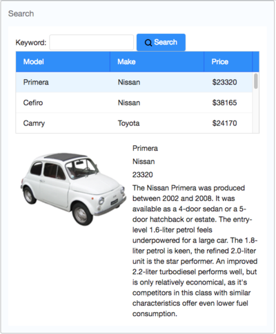
Our target application is a simple car catalog application. This application has two functions:
- Search cars.
- Enter a keyword in the input field, click Search and search results will be displayed in the car list below.
- View details.
- Click an item from the car list, the area below the car list will show the selected car's details including model, price, description, and preview.
Start from Example Project
You can get the source code of this article and import it to your IDE without starting from scratch. Please follow the README to run the project.
If you want to start a new project, please refer to ZK Installation Guide/Quick Start.
Declaring Domain Class
The following is the domain object that represents a car.
public class Car {
	private Integer id;
	private String model;
	private String make;
	private String preview;
	private String description;
	private Integer price;
	//omit getter and setter for brevity
}
We then define a service class to perform the business logic (search cars) shown below:
public interface CarService {

	/**
	 * Retrieve all cars in the catalog.
	 * @return all cars
	 */
	public List<Car> findAll();

	/**
	 * search cars according to keyword in  model and make.
	 * @param keyword for search
	 * @return list of car that matches the keyword
	 */
	public List<Car> search(String keyword);
}
In this example, we have defined a class, CarServeImpl, that implements the above interface. For simplicity, it uses a static list object as the data model. You can rewrite it so that it connects to a database in a real application. Its implementation details are not in the scope of this article, please refer to source code repository.
Building User Interface
UI is a good start to building an application as it helps you define the scope of your application. ZK provides hundreds of readily made UI components, so developers can rapidly build their desired user interface by combining and mix-matching these components without having to create a page from scratch.
In ZK, you can use ZK User Interface Markup Language (ZUML), an XML-formatted language, to describe UI. By ZK's convention, the files to describe the user interface with ZUML uses .zul as the name suffix. In zul files, one component is represented as an XML element (tag) and you can configure each component's style, behavior, and function by setting XML element's attributes. (check ZK Component Reference for details)
In this example application, first of all, we want to use a Window with the specified title and normal border as our application's frame.
As Window is the outermost component, it is called the root component. Window is a commonly used container because it makes your web application look like a desktop application. Besides, it can also enclose other components. All other components inside Window are called its child components and should be put in <window>'s body.
Extracted from search.zul
1 	<window title="Search" border="normal" width="600px">
2 		<!-- put child components inside a tag's body -->
3 	</window>
- Line 1: Specifying title bar text with
titleand make<window>display a normal border withborder. Forwidthattribute, use CSS like syntax such as800pxor60%.
Our example application's user interface is divided into 3 areas within the <window> (from top to bottom):
- search function
- car list
- car details.
Search Area
ZK components are like building blocks, you can combine and mix-match existing components to construct your desired UI. To allow users to search, we need a text to prompt users for input, a place to enter keywords, and a button for triggering the search. We can use the following ZK components to fulfill this requirement:
Extracted from search.zul
1 Keyword:
2 <textbox id="keywordBox" />
3 <button id="searchButton" label="Search" iconSclass="z-icon-search" style="margin: 0 0 5px 5px"/>
- Line 1~2: Specifying the
idattribute for some components allows you to control them by referencing their id. - Line 3: You can use built-in Font Awesome icon at
iconSclass. Please refer to LabelImageElement#IconSclass for details.
Car List Area
ZK provides several components to display a collection of data such as listbox, grid, and tree. In this example, we use a listbox to display a list of cars with 3 columns: Model, Make, and Price. Here we use listcell with static label to demonstrate structure of a listitem. Later, we'll talk about how to create listitem dynamically with a collection of data.
Extracted from search.zul
 1 <listbox id="carListbox" emptyMessage="No car found in the result" rows="5">
 2     <listhead>
 3         <listheader label="Model" />
 4         <listheader label="Make" />
 5         <listheader label="Price" width="20%"/>
 6     </listhead>
 7     <listitem>
 8         <listcell label="car model"></listcell>
 9         <listcell label="make"></listcell>
10         <listcell>$<label value="price" /></listcell>
11     </listitem>
12 </listbox>
- Line 1:
rowsdetermines the max visible row.emptyMessageis used to show a message whenlistboxcontains no items. - Line 2: The
listboxis a container component, and you can addlistheadto define a column. - Line 7: The
listitemis used to display data, and the number oflistcellin onelistitemusually equals to the number oflistheader.
Car Details Area
hlayout and vlayout are layout components which arrange their child components in horizontal and vertical order.
Extracted from search.zul
1 	<hlayout style="margin-top:20px" width="100%">
2 		<image id="previewImage" width="250px" />
3 		<vlayout hflex="1">
4 			<label id="modelLabel" />
5 			<label id="makeLabel" />
6 			<label id="priceLabel" />
7 			<label id="descriptionLabel" />
8 		</vlayout>
9 	</hlayout>
- Line 1: the
styleattribute allows you to customize component's style with CSS syntax.

