Transform Your UI with CSS Animation and Transition
Introduction
In today's enterprise web applications, creating a compelling and responsive user interface (UI) is paramount for user satisfaction and operational efficiency. Users expect not only functional but also interactive and visually engaging applications. One of the most effective ways to achieve this is through CSS animations and transitions, which can enhance the user experience by providing smooth and dynamic visuals.
CSS animations and transitions allow developers to animate the properties of HTML elements, adding interactivity and flair to the UI without extensive JavaScript code. This can help make your applications more engaging, guiding users through actions and highlighting important information intuitively.
Tailwind CSS, a utility-first CSS framework, offers a straightforward way to apply these animations and transitions. Tailwind CSS simplifies the styling process through a set of pre-defined utility classes, enabling developers to create modern and responsive designs efficiently. This approach reduces the need for custom CSS, leading to cleaner and more maintainable codebases.
In this article, we will demonstrate how to leverage Tailwind CSS to implement animations and transitions within the ZK framework. ZK is a powerful UI framework tailored for building enterprise-level, AJAX-driven web applications. By integrating Tailwind CSS with the ZK framework, you can easily enhance the user experience of your applications with minimal effort.
We will provide practical examples and detailed steps to guide you through the process of transforming your UI with CSS animations and transitions using Tailwind CSS. Whether you aim to add subtle hover effects or complex animations, this guide will arm you with the knowledge to improve your enterprise applications effectively. Let’s dive in!
What is Tailwind CSS?
Tailwind CSS is a utility-first CSS framework that emphasizes the utility-first approach. Unlike traditional CSS frameworks, which often provide pre-designed components such as buttons and forms, Tailwind CSS offers low-level utility classes that can be composed to build any design directly in your markup.
The core philosophy behind Tailwind CSS is to promote a clean and maintainable codebase by avoiding the need for custom CSS. Instead of crafting bespoke class names and styles for every element, developers apply pre-defined utility classes. This enables quick iterations and consistent designs across the application.
Benefits of Utility-First CSS
The utility-first approach brings several key benefits:
- Rapid Development: By using utility classes, you can style elements directly in your page, which speeds up the development process.
- Consistency: Utility classes ensure that the same spacing, colors, and typography are used throughout your application, maintaining visual consistency.
- Maintainability: With Tailwind, you avoid writing custom CSS for each component, reducing the complexity of your stylesheets and making it easier to maintain your code.
- Flexibility: Utility classes are composable. You can build almost any design by combining different utilities, making it highly flexible for custom user interfaces.
Tailwind CSS in Action
To illustrate the power of Tailwind CSS, let’s consider a simple example. Suppose you want to create a button with some padding, a blue background, and white text. With traditional CSS, you might write a custom class like this:
.button {
  padding: 1rem;
  background-color: blue;
  color: white;
}
In Tailwind CSS, you can achieve the same result directly in your page like this:
<button class="px-4 py-2 bg-blue-500 text-white">Click Me</button>
Here:
px-4sets the horizontal padding,py-2sets the vertical paddingbg-blue-500sets the background colortext-whitesets the text color.
This declarative approach is both intuitive and powerful, allowing for easy adjustments and experimentation.
By adopting Tailwind CSS, enterprise developers can streamline their workflow, enhance the visual consistency of their applications, and reduce the overhead associated with managing custom styles. In the next section, we will explore how to integrate Tailwind CSS with the ZK framework to leverage these benefits in your ZK applications.
Setup Tailwind CSS with ZK
Integrating Tailwind CSS with the ZK framework is a straightforward process. This section will guide you through the steps required to set up Tailwind CSS in your ZK project. By the end of this section, you will have Tailwind CSS ready to use for enhancing your ZK UI components.
Installing Tailwind CSS
First, you need to install Tailwind CSS in your project. This can be done using npm:
npm install tailwindcss
Initializing Tailwind CSS
Once Tailwind CSS is installed, you need to initialize it. This creates a default tailwind.config.js file where you can customize Tailwind's default configuration:
npx tailwindcss init
Configuring Tailwind to Work with ZK
In your tailwind.config.js file, specify the paths to all of your ZUL files so Tailwind can purge unused styles in production:
/** @type {import('tailwindcss').Config} */
module.exports = {
  content: ["./src/main/webapp/**/*.{zul,js}"],
  theme: {
    extend: {},
  },
  plugins: [],
}
Adding Tailwind Directives
Create a CSS file (e.g., styles.css) and add the Tailwind CSS directives to it:
@tailwind base;
@tailwind components;
@tailwind utilities;
Then, ensure this CSS file is included in your ZUL files:
 <?xml version="1.0" encoding="UTF-8"?>
<zk>
<style src="/path/to/styles.css"/>
<!-- Your ZUL content here -->
</zk>
Running Tailwind CLI
Finally, run the Tailwind CLI to watch for changes and generate the final CSS file:
npx tailwindcss -i ./src/input.css -o ./dist/output.css --watch
This command tells Tailwind to take your custom CSS file as input and output the processed CSS to a file that you specify, while also watching for changes.
With these steps, Tailwind CSS should be correctly set up and integrated with your ZK framework. You can now start using Tailwind's utility classes to style your ZK components. In the next sections, we will explore practical examples of implementing animations and transitions using Tailwind CSS.
Practical Examples
This section provides practical examples of using Tailwind CSS to enhance your ZK components with animations and transitions. We will walk through various use cases to help you understand how to apply Tailwind CSS effectively. Let's start with the first example.
Hover Effects
Hover effects are a straightforward way to add interactivity to your UI. In this example, we will demonstrate how to apply a background color change when a button is hovered over.
In your ZUL file, define a button with Tailwind CSS classes for padding, rounded corners, and initial background color. Add the hover effect class:
<a href="#" zclass="text-yellow-100"
class="inline-block bg-blue-300 p-2 rounded ... hover:bg-blue-500 transition-colors duration-300"> Hover over me </a>
bg-blue-300: Sets the initial background color.p-2: Sets padding.rounded: Rounds the corners.hover:bg-blue-500: Changes the background color to blue when hovered over.transition-colors: Enables smooth transition of color changes.duration-300: Sets the duration of the transition to 300ms.
In this example, we have turned an <a> tag into a button with CSS. You can also use a <button> element with similar classes if desired. This simple setup allows you to create interactive buttons quickly using Tailwind CSS utility classes.
Fade In/Out Effects
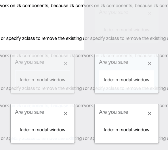
Fade effects are useful for modal dialogs, providing a smooth appearance and disappearance. In this example, we will use Tailwind CSS to create a modal that fades in when triggered.
In the ZUL file, define a button that makes a modal window visible and changes its opacity:
1 <button label="fade in modal"
2 onClick='confirmWin.visible=true;confirmWin.addSclass("opacity-100")'/>
3 <window id="confirmWin" title="Are you sure" mode="modal" ... visible="false"
4 class="opacity-0 transition-opacity duration-1000" closable="true"
5 onClose='self.visible=false;self.removeSclass("opacity-100");event.stopPropagation();'>
6 fade-in modal window </window>
opacity-0: Sets the initial opacity to 0 (completely transparent).transition-opacity: Enables smooth transition of opacity changes.duration-1000: Sets the duration of the transition to 1000ms (1 second).opacity-100: Changes the opacity to 100% (fully visible) when added.
This setup creates a modal window that smoothly fades in and out, enhancing the user experience with visually appealing transitions[1].
Bounce Effects
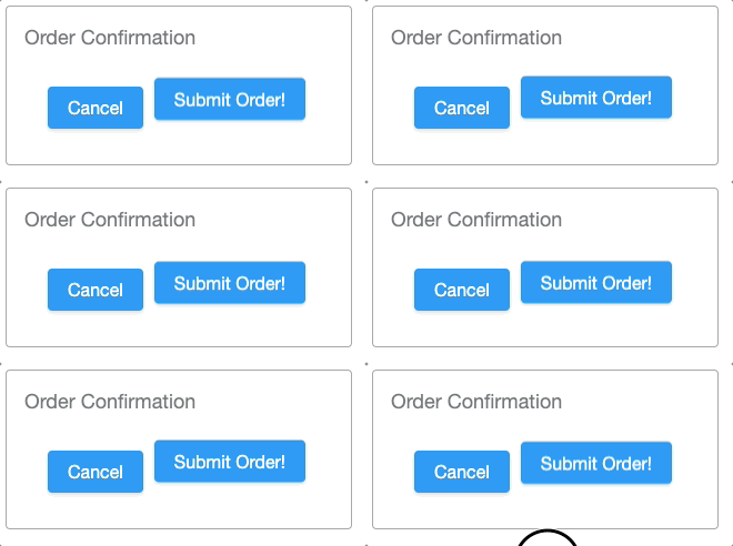
Bounce effects can make call-to-action buttons more noticeable and engaging. In this example, we will apply a bounce animation to a "Submit Order" button.
In a ZUL file, define the button with Tailwind CSS classes for padding and the bounce animation:
<button label="Submit Order!" class="... animate-bounce"/>
animate-bounce: Applies the bounce animation to the button.
Pulse Effects
Pulse effects are ideal for drawing attention to important notifications or alerts. In this example, we will use Tailwind CSS to create a pulsing effect for a notification box.
In your ZUL file, define a <div> with Tailwind CSS classes for background color, text color, padding, rounded corners, and the pulse animation:
<h:div class="bg-red-500 ... animate-pulse ..."> Important Notification </h:div>
animate-pulse: Applies the pulse animation.
This setup makes the notification box pulse, grabbing the user's attention effectively.
Expand/Collapse
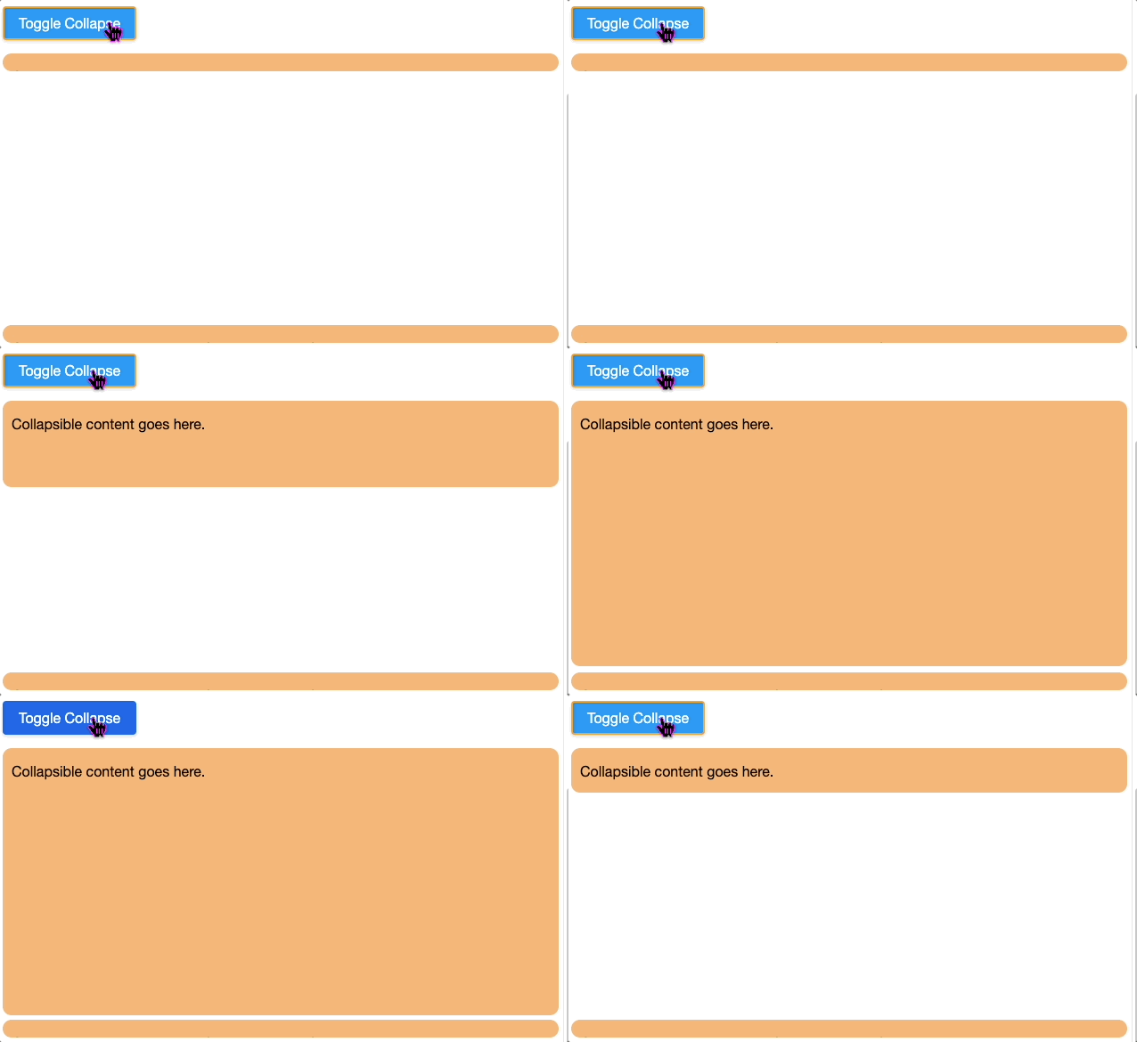
Expandable and collapsible content sections are useful for managing limited screen space and improving the user experience. In this example, we will create a section that expands and collapses with a smooth transition.
In your ZUL file, define a button to toggle the collapsible area made by a <div> for the with Tailwind CSS classes:
    <zscript><![CDATA[
    void toggleCollapse(){
        area.setHeight(area.getHeight().equals("0") ? "100%" : "0");
    }
    ]]></zscript>
    <div height="300px" sclass="my-1">
        <div id="area" class="transition-height duration-500 ..." height="0">
            Collapsible content goes here.
        </div>
    </div>
transition-height: Enables smooth transition of height changes.duration-500: Sets the duration of the transition to 500ms.ease-in-out: Applies an easing function for a more natural transition.
Additionally, you can create a "hover to expand" effect without any code as shown below:
    <div class="transition-all duration-500 ... h-0 hover:h-40">
        Collapsible content goes here (hover to expand).
        <h:br/>
        more content here..
    </div>
transition-all: Enables smooth transition of various properties.h-0: Sets the initial height to 0.hover:h-40: Expands the height to 40 when hovered over.
This provides a smooth expand and collapse effect for content sections, enhancing the user interface
Pop-in Alerts
Pop-in alerts grab user attention by appearing with a scaling effect. In this example, we will use Tailwind CSS to create a pop-in alert message.
In your ZUL file, define a button that triggers the alert and a <div> for the alert box with Tailwind CSS classes for transformations and transition effects:
    <button label="pop in alert" sclass="my-1" onClick='SclassHelper.toggle(alertbox, "scale-0", "scale-100")'/>
    <div id="alertbox"
         class="transform transition-transform duration-500 ease-in-out scale-0 p-4 mb-4 text-white bg-red-500 rounded shadow-lg">
        <div class="font-bold">Alert!</div>
        <div>This is a pop-in alert message.</div>
    </div>
scale-0: Sets the initial scale to 0 (hidden).transition-transform: Enables smooth scaling transformations.duration-500: Sets the duration of the transition to 500ms.scale-100: Scales the element to its full size (visible).
Slide-In Panels
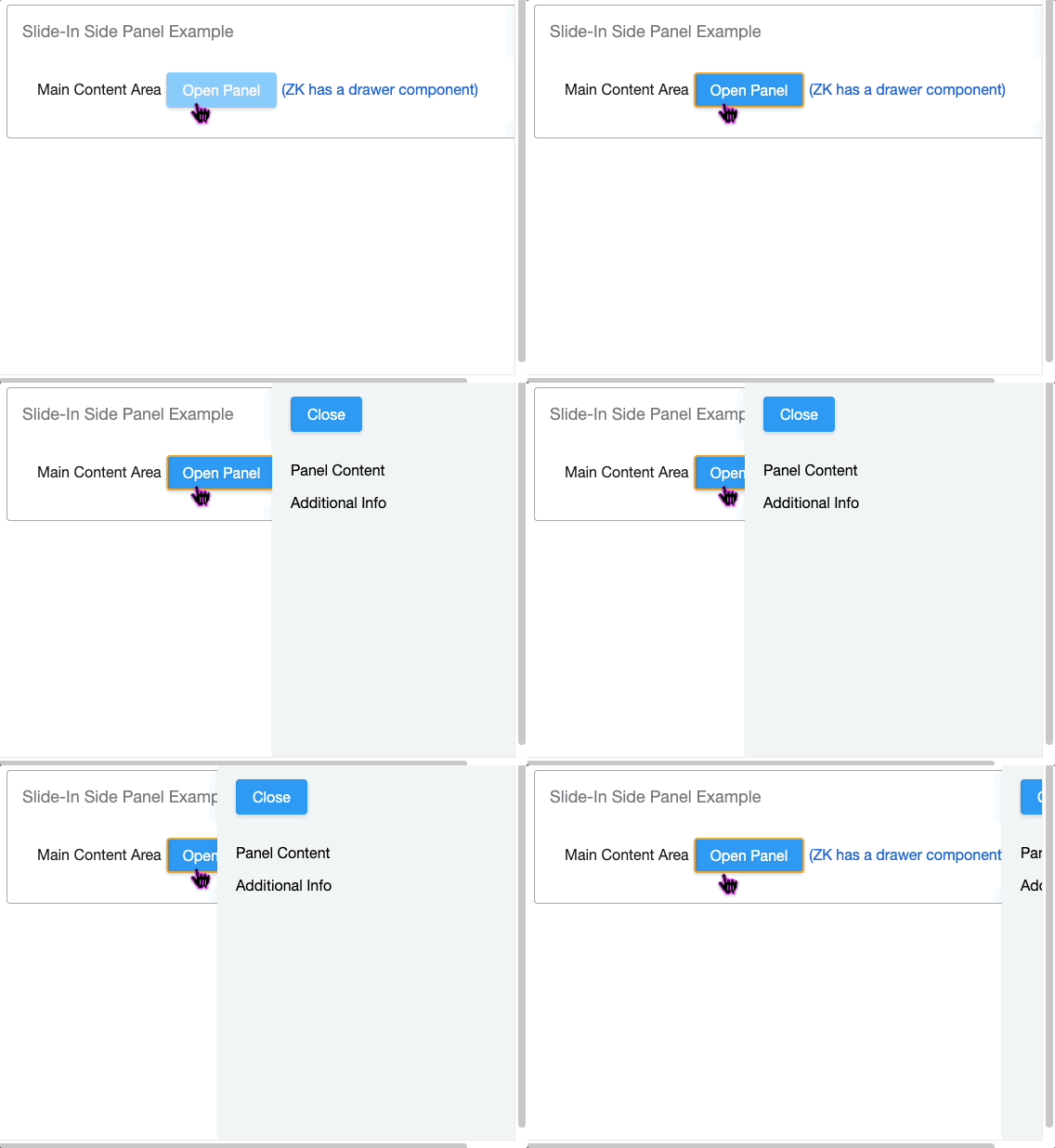
Slide-in panels are useful for sidebars or notifications. In this example, we will create a side panel that slides into view from the right.
In your ZUL file, define a button to toggle the side panel and the side panel itself with Tailwind CSS classes for transformations and transition effects:
<button id="open-panel-button" class="mx-1" label="Open Panel" onClick='SclassHelper.toggle(sidePanel, "translate-x-full", "translate-x-0")'/>
...
    <!-- Slide-In Side Panel -->
    <vlayout id="sidePanel"
             class="fixed top-0 right-0 w-64 h-full bg-gray-100 shadow-lg transform transition-transform duration-500 ease-in-out translate-x-full z-50">
        <button label="Close" class="m-4" onClick='SclassHelper.toggle(sidePanel, "translate-x-full", "translate-x-0")'/>
        <label value="Panel Content" class="m-4"/>
        <label value="Additional Info" class="m-4"/>
    </vlayout>
translate-x-full: Sets the initial position off-screen to the right.transition-transform: Enables smooth translations.duration-500: Sets the duration of the transition to 500ms.translate-x-0: Moves the element on-screen (visible)[2].
Loading Spinners
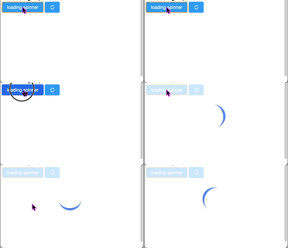
Loading spinners indicate that a process is ongoing. In this example, we will create a loading spinner that appears while an operation is being performed.
In your ZUL file, define a button to trigger the loading spinner and a
    <div id="loadingEffect" visible="false" class="fixed inset-0 flex items-center justify-center bg-white bg-opacity-75 z-50">
        <h:div class="animate-spin rounded-full h-16 w-16 border-t-8 border-blue-500"></h:div>
    </div>
animate-spin: Applies the spin animation.
These examples illustrate how Tailwind CSS can be used to add sleek, interactive animations and transitions to your ZK components, significantly enhancing the user experience.
Ping Effects
Ping effects are great for highlighting new messages or notifications by using a pulsing ring animation. In this example, we will create a button with a ping effect to indicate new messages.
In your ZUL file, define a button and a wrapper with Tailwind CSS classes for positioning and the ping animation:
    <h:span class="relative inline-flex">
        <button label="My Messages" sclass="inline-flex my-1"/>
        <h:span class="relative flex h-3 w-3 top-0 right-2 mt-0 -mr-1">
            <h:span class="animate-ping absolute inline-flex h-full w-full rounded-full bg-orange-400 opacity-75"></h:span>
            <h:span class="relative inline-flex rounded-full h-3 w-3 bg-orange-500"></h:span>
        </h:span>
    </h:span>
animate-ping: Applies the ping animation, creating a pulsing ring around the element.
Slide-In Notification
Slide-in notifications are useful for drawing users’ attention to brief messages without disrupting their workflow. In this example, we will create a notification that slides in from the top of the screen.
In your ZUL file, define a button to trigger the notification and a <button label="Show Notification"
onClick='SclassHelper.toggle(notification, "translate-y-0", "-translate-y-full")'/>
<div id="notification"
class="fixed top-0 left-0 w-full ... transform -translate-y-full transition-transform duration-500">
This is a slide-in notification
</div>
translate-y-0: Sets the initial position on-screen.-translate-y-full: Moves the element off-screen (hidden).transition-transform: Enables smooth translations.duration-500: Sets the duration of the transition to 500ms.
Expandable Search Bar
Expandable search bars aim to save space and create a cleaner UI appearance by expanding when focused. In this example, we will create an expandable search bar using Tailwind CSS.
In your ZUL file, define a <textbox> with Tailwind CSS classes for width transition and animation:
<textbox placeholder="Search..." class="w-16 p-2 transition-width duration-300 focus:w-64"/>
w-16: Sets the initial width.transition-width: Enables smooth transition of width changes.duration-300: Sets the duration of the transition to 300ms.focus:w-64: Expands the width to 64 when focused.
Potential CSS Class Conflicts
While integrating Tailwind CSS with the ZK framework adds powerful visual enhancements to your UI, there are some common challenges you might encounter. This section addresses these challenges and provides solutions to help you seamlessly integrate Tailwind CSS.
One common issue is the conflict between Tailwind CSS classes and ZK's built-in styles. ZK components come with predefined CSS classes that may override or conflict with Tailwind's utility classes. You can find out this problem with the browser developer tool.
Solution 1: Use zclass to Remove Component Styles
You can solve this by using the zclass attribute to specify custom classes that should override the default styles provided by ZK components. For example:
<a href="#"
zclass="text-yellow-100"
class="... ... hover:bg-blue-500 transition-colors duration-300"> Hover over me </a>
Because zk has its own color defined, using text-yellow-100 cannot override the predefined color. Specify it at zclass can remove the built-in zk style.
Solution 2: Use the style Attribute for Complex Components
For more complex components like a ZK window, using the zclass will remove all built-in styles, making the component lose its intended appearance. In such cases, you should use the style attribute to override specific styles without affecting the entire component.
Conclusion
Enhancing your ZK applications with Tailwind CSS animations and transitions can notably improve the user experience, making your interfaces more interactive and visually appealing. By leveraging Tailwind's utility-first approach, you can quickly and efficiently apply a wide range of animations and transitions directly in your zul, leading to cleaner and more maintainable code.
By combining the flexibility of Tailwind CSS with the powerful features of the ZK framework, you can create modern, responsive, and engaging enterprise web applications. We hope this guide has provided you with valuable insights and practical tools to get started on transforming your UI with CSS animations and transitions. Happy coding!
Download Source Code
To access the complete source code of the examples discussed, please visit the GitHub repository at https://github.com/zkoss-demo/tailwindcss.

