Drag-and-Drop Effects
There are 2 scopes to customize the drag-and-drop effects: per-widget and application scope.
Per-Widget Customization
Widget has a set of methods for handling drag-and-drop. You could customize them based on your requirement.
If you want to customize a particular widget, you could do as follows[1].
var superwgt = {};
zk.override(wgt, superwgt, {
    initDrag_: function () {
        //your implementation
        superwgt.initDrag_.apply(this, arguments); //if you want to call back the default implementation
    }
});
If you want to override all widgets of particular class, say, Combobox, you could do as follows.
var supercomobox = {};
zk.override(zul.inp.Combobox.prototype, supercomobox, {
    initDrag_: function () {
        //your implementation
        supercomobox.initDrag_.apply(this, arguments); //if you want to call back the default implementation
    }
});
If you override Widget, then all widgets are affected[2].
var supercomobox = {};
zk.override(zul.inp.Combobox.prototype, supercomobox, {
    initDrag_: function () {
        //your implementation
        supercomobox.initDrag_.apply(this, arguments); //if you want to call back the default implementation
    }
});
Custom widget class approach: you can extend a default ZK widget class into your own extended widget class. This class can be assigned from zul using the xmlns:w="client" namespace, and the w:use="custom.MyCustomClass" attribute on the target component, or using component.setWidgetClass(...) from Java.
	zk.$package("custom");
	zk.afterLoad("zul.wgt", function () {
		custom.MyButton = zk.$extends(zul.wgt.Button, {
			dropEffect_: function (onHovering) {
		      this.$supers("dropEffect_", arguments);
		      if(onHovering){
		    	  jq(this).addClass("customdrop");
		      }else{
		    	  jq(this).removeClass("customdrop");
		      }
	    	}
	  });
	});
Here is a list of methods you could override. For a complete list, please refer to Widget.
| Method | Description |
|---|---|
| Widget.dropEffect_(boolean) | Called to have some visual effect when the user is dragging a widget over this widget and this widget is droppable.
Notice it is the effect to indicate that a widget is droppable. |
| Widget.onDrop_(Draggable, Event) | Called to fire the onDrop event.
You could override it to implement some effects to indicate dropping. |
| Widget.getDragOptions_(Map) | Returns the options used to instantiate Draggable.
There is a lot what you could customize with this method, since the options control many effects, such getDragOptions_: function(map) {
if(windowOptions == null){
windowOptions = zk.copy(new Map(),map);
//Commented out: chain effect from multiple overrides
//var oldstarteffect = map.starteffect;
windowOptions.starteffect = function(dg) {
//oldstarteffect.apply(this,arguments);
jq(dg.node).css("background-color","yellow");
}
}
return windowOptions;
}Please refer to Draggable and the source code for more information. |
| Widget.cloneDrag_(Draggable, Offset) | Called to create the visual effect representing what is being dragged.
In other words, it creates the DOM element that will be moved with the mouse pointer when the user is dragging. |
| Widget.uncloneDrag_(Draggable) | Undo the visual effect created by Widget.cloneDrag_(Draggable, Offset).
In other words, it removes the DOM element that was created. |
- ↑ zk.override(Object, Map, Map) is a utility to simplify the overriding of a method.
- ↑ It is also a browser-level customization
Droppable Visual Feedback
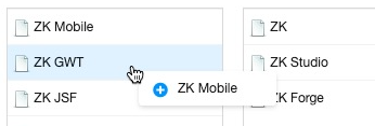
When you drag a listitem to a droppable component, it shows a plus icon:
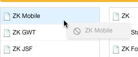
If drag it to a non-droppable component, it shows a ban icon:
But other components don't provide this visual feedback by default, you need to override a Widget's getDragMessage_() and return a text, see drag-feedback.js.
Application Scope Customization
DnD provides a collection of drag-and-drop utilities. By customizing it, all widgets in the whole application will be affected.
For example, if you would like to customize ghosting" of the DOM element being dragged, you can override DnD.ghost(Draggable, Offset, String) as follows.
var superghost = zk.DnD.ghost;
zk.DnD.ghost = function (drag, ofs, msg) {
    if (msg != null)
        return superghost(drag, ofs, msg);
   //do whatever you want
}

