The Layout Components
![]() This documentation is for an older version of ZK. For the latest one, please click here.
This documentation is for an older version of ZK. For the latest one, please click here.
Borderlayout
Components: borderlayout, north, south, center,west,east
The layout component is a nested component. The parent component is a borderlayout, and its』 children components include north, south, center, west, and east. The combination of children components of borderlayout is left up to the developer. For example, if you want to divide the area into three regions (veritically), you could try the following combination,
<zk>
	<borderlayout height="500px">
	    <east>
	        The East
	    </east>
	    <center>
	        The Center
	    </center>
	    <west>
	        The West
	    </west>
	</borderlayout>
</zk>
or, you could divide the area into three regions (horizontally) as follows,
<zk>
	<borderlayout height="500px">
	    <north>
	        The North
	    </north>
	    <center>
	        The Center
	    </center>
	    <south>
	        The South
	    </south>
	</borderlayout>
</zk>
And you could embed any kind of ZK components into each of these regions according to your requirements.
A Nested borderlayout Component
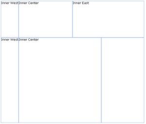
Moreover, you can embed one layout component into another to divide the area into more regions as follows,
<zk>
	<borderlayout height="500px">
		<north size="30%">
			<borderlayout height="250px">
				<west border="normal"> Inner West</west>
				<center> Inner Center</center>
				<east size="50%" border="normal"> Inner East</east>
			</borderlayout>
		</north>
		<center border="normal">
			<borderlayout>
				<west border="normal"> Inner West</west>
				<center border="normal"> Inner Center</center>
				<east size="30%" border="normal">
				</east>
			</borderlayout>
		</center>
	</borderlayout>
</zk>
The size and border Properties
You are able to specify the size attribute of the following children components (north,south,east,west) to determine their sizes. However, the functionality of size attribute depends on the type of children components (vertically or horizontally). For horizontal components (north, and south), the size attribute determines their height. As for vertically components (east, and west), the size attribute determines their width.
The border attribute determines whether the layout components jave a border, this includes all children components of borderlayout. . The following table specifies values of the border attribute.
none (default)
|
Without border |
normal
|
With border |
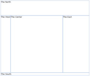
Here is an example.
<zk>
	<borderlayout height="500px">
		<north size="30%" border="normal"> The North</north>
		<east size="30%" border="normal"> The East</east>
		<center border="normal"> The Center</center>
		<west border="normal"> The West</west>
		<south border="normal"> The South </south>
	</borderlayout>
</zk>
The splittable and collapsible Properties
If you would like to make your layout components splittable, you can set the splittable attribute as true.
In addition, you can make a layout component collapsible by setting the collapsible attribute to true.
<zk>
	<borderlayout height="500px">
		<north size="20%" splittable="true" collapsible="true" />
		<east size="20%" splittable="true" collapsible="true" />
		<center border="normal" />
		<west size="20%" splittable="true" collapsible="true" />
		<south size="30%" border="normal" splittable="true" collapsible="true" />
	</borderlayout>
</zk>
The maxsize and minisize Properties
When you make a layout component splittable, you can use the maxsize and minisize attributes to set the maximum and minimum size of the area.
<north splittable="true" maxsize="500" minisize="200"/>
The flex property
If the size of browser has been changed, the layout components will re-size themselves automatically to fit the size of the browser. If you would like the ZK components embedded within these layout components to be auto-resized as well, you can set the flex attribute of the layout component to true.
The open Property
To know whether a layout is collapsed, you can check the value of the open attribute (i.e. use the isOpen method). To open or collapse programmatically, you can set the value of the open attribute (i.e., use the setOpen method).
The onOpen Event
When a layout is collapsed or opened by a user, the onOpen event is sent to the application.

