Implementing the View
![]() This article is out of date, please refer to http://books.zkoss.org/zkessentials-book/master/ for more up to date information.
This article is out of date, please refer to http://books.zkoss.org/zkessentials-book/master/ for more up to date information.
Implementing the View
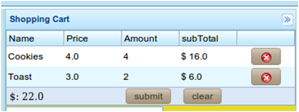
Suppose the figure below is the requirement for the "Shopping Cart" in our shopping cart application:
Here we have five columns, four of them have headers to denote the data field, and a variable number of rows containing product orders. In this case, we also have a requirement to display a picture of the product selected in the shopping cart. In this case, we use the Listbox as this enables developers to select an item firing an onSelect event when this occurs.
Introduction to the ZK Listbox
A ZK Listbox contains a few constituents, listitem, listcell, listhead and listheader.
A Simple Listbox example
The simplest Listbox can be outputted using Listitems. In the example below, we place 3 Listitems into the Listbox.
<zk>
	<listbox>
	    <listitem label="Butter Pecan"/>
	    <listitem label="Chocolate Chip"/>
	    <listitem label="Raspberry Ripple"/>
	</listbox>
</zk>
The Select Mold
In addition to the Listbox which comes in two molds, default and select. The select mold enables the HTML SELECT tag to be generated thus producing the following content. The following example demonstrates the effect of changing the mold on the Listbox.
<zk>
	<listbox mold=”select”>
	    <listitem label="Butter Pecan"/>
	    <listitem label="Chocolate Chip"/>
	    <listitem label="Raspberry Ripple"/>
	</listbox>
</zk>
Multiple Columns and Headers
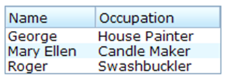
The Listbox also supports multiple columns and headers. In the following example we use Listhead and Listheader to create headers with two columns. The following example demonstrates a multi-column Listbox with a header. Please note that you can have a multi-column Listbox without the headers but by specifying more than one Listcell in a particular Listitem.
<zk>
	<listbox width="200px">
		<listhead>
			<listheader label="Name"/>
			<listheader label="Occupation"/>
		</listhead>
		<listitem>
			 <listcell label="George"/>
			 <listcell label="House Painter"/>
		</listitem>
		<listitem>
			<listcell label="Mary Ellen"/>
			<listcell label="Candle Maker"/>
		</listitem>
		<listitem>
			<listcell label="Roger"/>
			<listcell label="Swashbuckler"/>
		</listitem>
	</listbox>
</zk>
The Shopping cart view Implementation
The implementation of the shopping cart view is placed in the right side section of the Borderlayout. Just like the previous section, the Listbox is encased by a Div component which is applied with a controller class to extend the GenericForwardComposer class. We’ll go into details of this controller class in the next section of this book. The only special part of the Listbox that we haven’t covered is the Listfooter which is encased in the tag Listfoot. This will place the specified components on the buttons. In this case, it would be the subtotal with a button to submit an order and a button to clear the order.
<east  title="Shopping Cart" size="30%" flex="true" splittable="true" collapsible="true">
		<div style="background:#E6D92C; height:100%" apply="demo.web.ui.ctrl.ShoppingCartViewCtrl">

			<listbox id="shoppingCartListbox">
				<listhead sizable="true">
					<listheader label="Name" />
					<listheader label="Price" />
					<listheader label="Amount" />
					<listheader label="subTotal"/>
					<listheader align="center"/>
				</listhead>
				<listfoot>
					<listfooter span="2" id="subtotalFooter"></listfooter>
					<listfooter><button id="submitOrderBtn" label="submit"/></listfooter>
					<listfooter><button id="clearBtn" label="clear"/></listfooter>
				</listfoot>
			</listbox>
			<textbox id="descTxb" rows="10" width="200px" value="Note for this order." />
			<image id="cartItemImage" />
		</div>
	</east>


